The Top Ten Therapist Website Examples

These are great examples of therapists websites from private practices, child therapists, group practices and physical therapist websites. Get inspiration and insight for your own website.
(You may also want to check out our new and revised list: The Best Therapist Websites of 2022!)
Do you want a counseling website that:
Speaks to your ideal client?
Encourages people to reach out?
Attracts the right people?
Helps your private practice grow?
Then this top-ten list is the one you’ve been waiting for!
This is the ultimate guide to real-world examples of therapist websites that are doing things right.
These great therapist website examples can help you get a clearer idea.
Let’s dive in!

Table of Contents
Why do real-world examples matter so much?
Let’s be honest.
Lots of people will give you website advice that isn’t actually helpful.
“Have a strong presence on the web,” they’ll tell you. Or, “Redesign your website to attract more clients.”
But having a general idea that you want a “good website” and knowing what that really looks like are two very different things.
You need to see real-world therapist website examples that get things right.
You don’t just need to see them, but you need to take them apart piece by piece, and figure out why those websites are working, so that when you want your own website to work, you really understand what that involves.
It’s like the difference between enjoying a nice slice of apple pie that’s been brought to your table by a waiter, and standing next to the chef and looking over his shoulder while he mixes the ingredients and rolls out the crust.
If you want to be able to reproduce the results – you have to know what ingredients went into the pie.
In this post, I’m going to share some therapist website examples done right. But I won’t just put those examples in front of you and walk away. We’re going to analyze them together, talk about what’s working and why.
Though the list is numbered from 1-10, these therapist website examples aren’t given in a particular order. My goal here was to find a variety of therapy websites with different strengths and focuses, to give a broad overview of what a good therapist website can look like.
By the time you’re done reading these case studies, you’ll have a real-world understanding of what a successful therapist website looks like, and what exactly goes into making it work.
Curious? Let’s get started!
#1 Mary Diorio Psychotherapy
First on our list is the website of psychotherapist Mary Dorio.
Let’s take a minute here to talk about all the things that Mary’s website gets right.
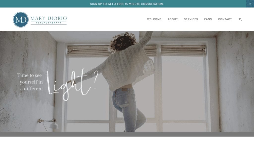
The very first thing that you see when this website comes up is this gorgeous hero image.
As Wikipedia explains, “In web design, a hero image is a large web banner image, prominently placed on a web page, generally in the front and center. The hero image is often the first visual element a visitor encounters on the site; it presents an overview of the site’s most important content.”
Your hero image is your first chance to tell your visitor that they are in the right place.
The hero image established the tone of your website, and creates an immediate, emotional response in the visitor. It is crucial to get it right.
And we can see that Mary’s website did just that. The image used here is bright and hopeful, and immediately tells the visitor that they are in a place that will be uplifting and inspiring.
Other ways this therapist website example stands out:
- Colors. The colors used on this site are also lovely and consistent, the various shades of blue range from calming to vibrant, and create a consistent, lovely feel.
- Fonts. I love the use of the cursive font that is placed throughout this site. It isn’t overdone, and the cursive is actually legible, which is the pitfall that many of the fancier fonts can sometimes fall into. It brings a nice sense of personality to the whole site.
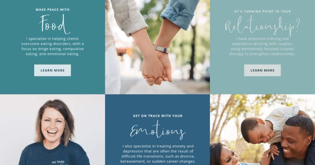
- Specialties are clearly defined. Using the lovely section below, Mary clearly states what her areas of focus are, presents them in a way that is visually pleasing and up-beat, and has a clear call to action for each one.
How this website could be improved:
- Make Contacting You Easy. I’d recommend putting a phone number right at the top of the homepage, where it is very easy to see, so that visitors can “click to call.” It is important to make sure that someone who is in a hurry and just wants to contact you immediately will not need to scroll around searching for a number.
- Subscription. Also, asking people to subscribe for a newsletter in order to get a ten minute consultation is probably not the best way to go. It is great to have a way to keep in touch with people who aren’t yet ready to get on the phone and talk about possibly having an appointment. Having a free resource that they can download is ideal. But asking people who do want to talk on the phone to sign up for an email list may actually make them less likely to set up that consultation. I’d suggest offering something else in return for a newsletter sign up.
How can we help YOUR practice grow?
FULLY-CUSTOM WEBSITE: We'll create your website content, and design a custom website just for you!
SEO: Rank higher in search results with Search Engine Optimization.
#2 Cassandra Sharp Physical Therapy
I will admit to being a bit biased in favor of Cassandra’s Website, since it is a site that I designed. But I really wanted to include it as an example of a Physical Therapy website, as I often see that websites for PTs are overly medical and have a very cold feel. This site shows that it is possible to approach physical therapy website design in a way that is warm, and shows a lot of personality, and in a way that is likely to foster a feeling of connection and trust in website visitors.
Things this website gets right:
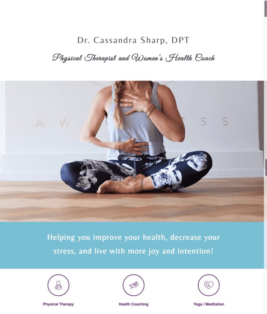
- Look and Feel. The site really reflects Cassandra’s whole-body approach to therapy. The pictures helps to give you a very clear picture of the kind of approach to wellness that you get when working with Cassandra. The inclusion of her personal photography, as an expression of her commitment to travel and health through movement, is a great addition to the site.
- Movement. The small animations on the site create a dynamic feel and add interest, without being overpowering or distracting from the site’s content.
How this website could be improved:
- A strong lead magnet. Cassandra has a call to action inviting people to sign up for her newsletter, which is great! However, few people will sign up without being offered some sort of concrete incentive. Offering a checklist, pdf, or other free content in exchange for the newsletter sign up would lead to better results.
- Blog posts / Class descriptions. There are a number of classes listed, which is great. I think it would be even better if there were a blog post going into detail about what each class is like and how students would benefit from taking it.
#3 Wila Therapy
Continuing our exploration of therapist website examples, the Wila Affordable Therapy website is a very strong example of a group practice site that is easy to navigate and very well laid out.
Let’s take a closer look.
Things this website gets right:
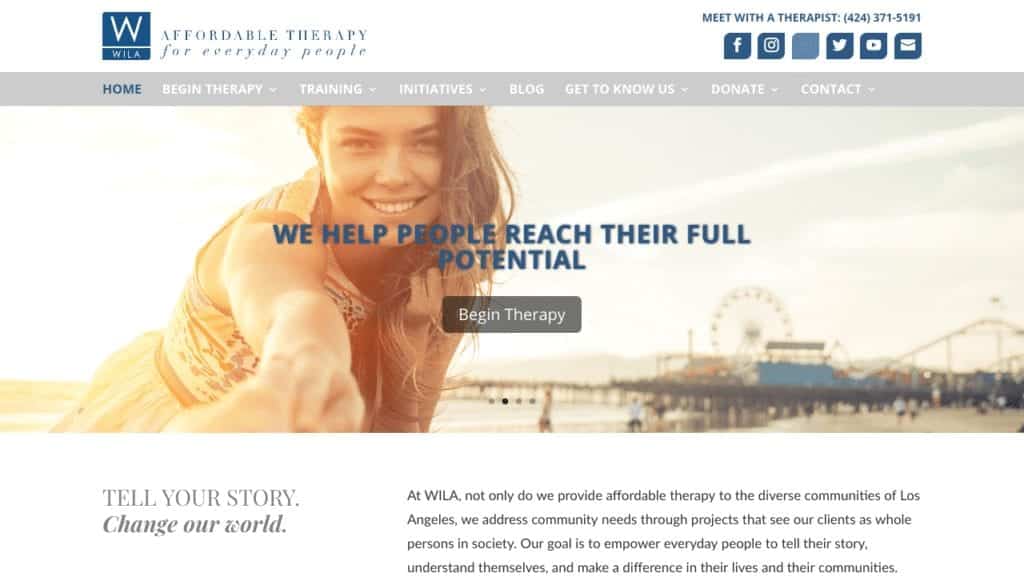
- Contact information and Call to Action. One of the best things about this website is that it features clear contact information right at the top, and a clear, powerful call to action right in the center of the hero image. You can see the phone number prominently displayed right in the upper right-hand corner, and the hero image is great, accompanied by the strong CTA: “Begin Therapy.” All really well done.
- Images. One problem that I see frequently on therapist websites is that they feature a lot of pictures of people who are sad and obviously suffering. While it is true that your site may be visited by people who are currently struggling, the website should feature uplifting images that give people a sense of the way that their lives may be transformed through getting help. This website does a great job of using images that are positive and hopeful.
- User Experience. This website is easy to navigate. There is a lot of information here, as this is a larger practice and has a variety of offerings. But the site is easy to understand and each visitor will be able to quickly and easily find the information that is relevant to them.
How this website could be improved:
- Consider de-emphasizing social media. Right now, social media buttons are given a very prominent place right at the top of the page near the phone number. Although Social media is great in general, at the moment when someone is actually on your homepage, you don’t want them to get distracted and end up clicking around on Facebook for an hour. If they get distracted by Social Media, they may forget to ever come back to your site. So on your homepage you don’t want to make your social media link so prominent. It is better to put them in the footer. And emphasize instead ways for people to take action by contacting you.
- Make the phone number clickable. It’s great that the phone number is right up at the top of the page but it would be even better if people could click that phone number to immediately call. Often people access websites through their cell phone and they’re not going to be able to remember the numbers long enough to switch to their phone and actually dial the number. So having clickable phone numbers and email addresses is really crucial.
- Offer a lead magnet. As with the previous website, having a way for visitors to opt-in and give you their email address in exchange for some kind of free content, can give you a way to keep in touch even with those visitors who aren’t quite ready to go ahead and contact you at that particular moment. So the website would be stronger if there were a lead Magnet or other effective way to maintain contact with website visitors.
#4 Deep Eddy Psychotherapy
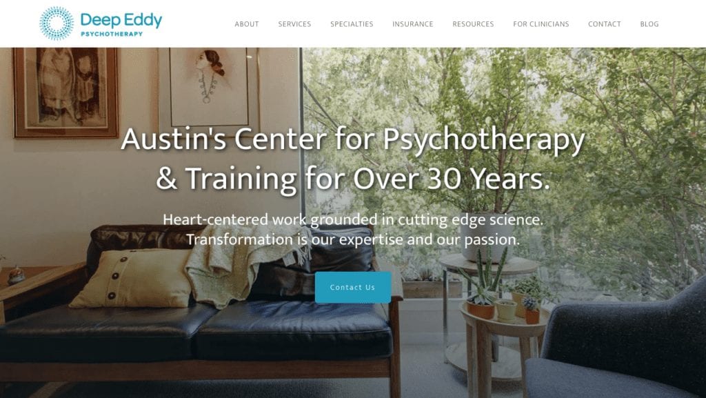
As soon as I saw the Deep Eddy Pshychotherapy website I knew that it had to be included in our list of great therapist website examples. The first thing I love about this practice is its name. Deep Eddy Psychotherapy tells you so much about the way that this practice is unique to the area that it serves. Plus the main hero image, is so strong. They have a gorgeous photo of their own offices which tells you so much about the feeling that you would have as a client coming to their office for the first time. You just look at this image and feel like their office is a place that you want to be.
Things this website gets right:
- Extremely strong messaging. Let’s just take a minute and really look carefully at what they’ve put at the very center of their hero image. It says: “Austin’s Center for Psychotherapy and Training for Over 30 Years. Heart-centered work grounded in cutting edge science. Transformation is our expertise and our passion.” The first thing that it tells you is that they’re deeply connected to the area that they serve because they put their location, Austin right up at the beginning. The next thing they do is build authority by telling you that they’ve been serving clients for over 30 years. And then they hit a home run with this amazing mission statement. They say “Heart-centered work grounded in cutting-edge science.” This tells you that they’re focused on people’s emotions and their well-being, and that they base their treatment on real evidence. And then they have this amazing sentence, “Transformation is our expertise and our passion.” It’s hard to get a mission statement that gets more done and is more to the point than that!! The copywriting on this website is phenomenal.
- Strong Call to Action. Immediately after that strong message they have a contact button, which means that people can immediately know how to get in touch with them which is great.
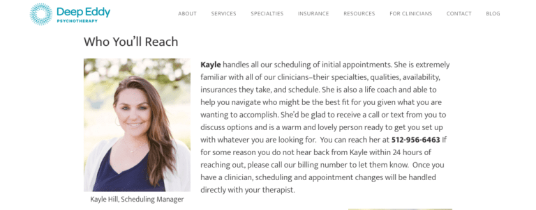
- Lots of contact information and staff bios. This is by far the best therapist website example of a contact page that I have ever seen!! When you click the contact button you’re taken to a great page that has clickable phone numbers, maps, and a “contact us” form for people who don’t want to call. Then there is a brief section that gives bios of different staff members with approachable friendly pictures. Most impressively, they have a section that explains “Who’ll you’ll speak to when you call,” and reassures potential clients that the intake process will be handled expertly and in a caring way. I can’t overemphasize how important that is! Also, they don’t spend too much time talking about themselves. They give people just enough to feel comfortable about actually contacting them, and I think that the idea of putting some photos of people who work at their Center actually on the contact page is really smart. You’ll notice that they also have several more photos of their actual offices that give you a real sense of this feel that you got in their office and makes it less intimidating to think about going there
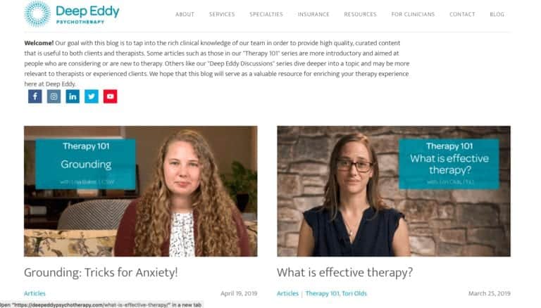
- Great use of videos. Blog Page features introduction videos, and other videos that are relatable and help make their practice seem more warm and friendly and approachable.
How this website could be improved:
Services page. When you click the services link you are taken to what is essentially description of their fees. I think that this is a little bit confusing for users who might be pressing Services button expecting to hear what kinds of therapy are offered and if there any other other services that the practice provides. I would suggest changing the way that is categorized so that what’s currently labeled as “Specialties” is under “Services.” The information that is currently in the Services section could be moved to be included with the insurance inforamtion.
Fewer headshots on the homepage. Right now on the homepage they have a lot of headshots of all the different people who are working in their practice. It’s a large practice, which isn’t necessarily a problem, but it ends up being a lot to scroll through right on the homepage. I would suggest instead to have this section broken down by office location, with the option to click on a specific location and get more information about the therapists who work out of that office. Otherwise, you risk overwhelming website visitors and also losing some of the personal feel that the website otherwise succeeds in creating.

#5 Southern California Counseling Center
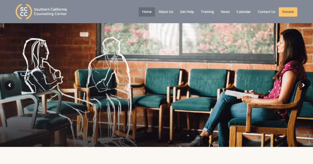
Next up on our list of therapist website examples is The Southern California Counseling Center. This website has a very different look and feel than most therapist websites, and I think the design does a lot that is really interesting and smart.
Things this website gets right:
- Attention grabbing hero image. The hero image that they’ve created here is really unusual and attention-grabbing. I think the idea of making it possible for anyone to envision themselves coming to them as a client, by having the client represented with a drawing is very original. Also, the combination of the real photo with the drawing is a very compelling and trendy. I think it really makes them stand out and is very unique.
Who we are section. The “Who We Are” section on their home page is really beautifully put together, and we can contrast it with the previous website that we looked at where we said they had a ton of head shots and it was kind of overwhelming and too much. In contrast, this practice has created a really beautiful graphic taking a number of photos of different people who work there and really creating something that is warm, interesting and inviting. This is also an example of the power of really good photography. None of these photos are boring or overly formal headshots. Each one of these is different and really shows you some of the personality of the person who’s being photographed. So this is really really well done.
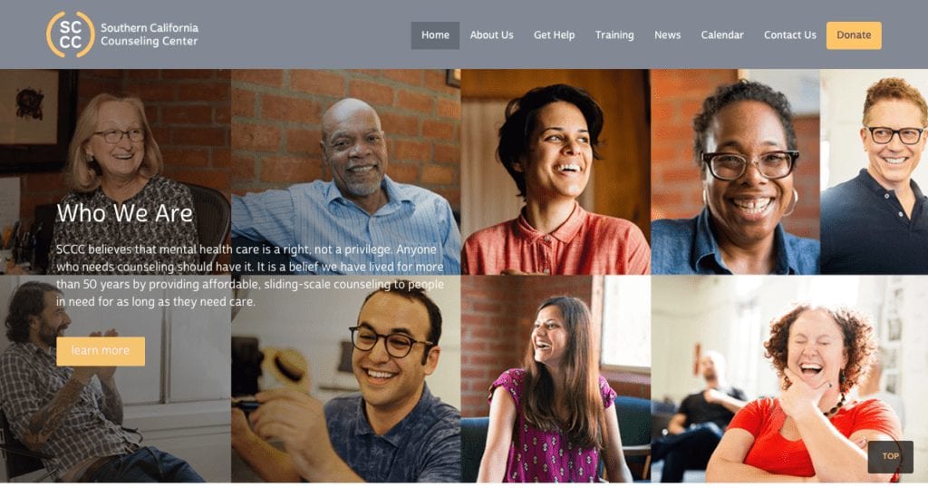
- Inclusion of a video on the home page. The video that they include on their homepage is very professionally done and does a great job of giving some of the history of their sensor and talking about who they are and their commitment to the work that they do.
How this website could be improved:
Remove the slider on the home page and focus on one hero image. Now they’re hero images a slider with three different images that rotate. And wolf spiders used to be very popular on websites, now they’re actually much less popular due in part to the fact that Studies have shown that sliding images like that can actually reduce the likelihood of a website visitor actually taking action on the page. This may be because it encourages people to kind of sit back and possibly watch all the pictures cruel by. So I would recommend picking just one of those three images and using that as a focal point for the home set homepage and getting rid of the sliding images.
How can we help YOUR practice grow?
FULLY-CUSTOM WEBSITE: We'll create your website content, and design a custom website just for you!
SEO: Rank higher in search results with Search Engine Optimization.
#6 In Shifra's Arms
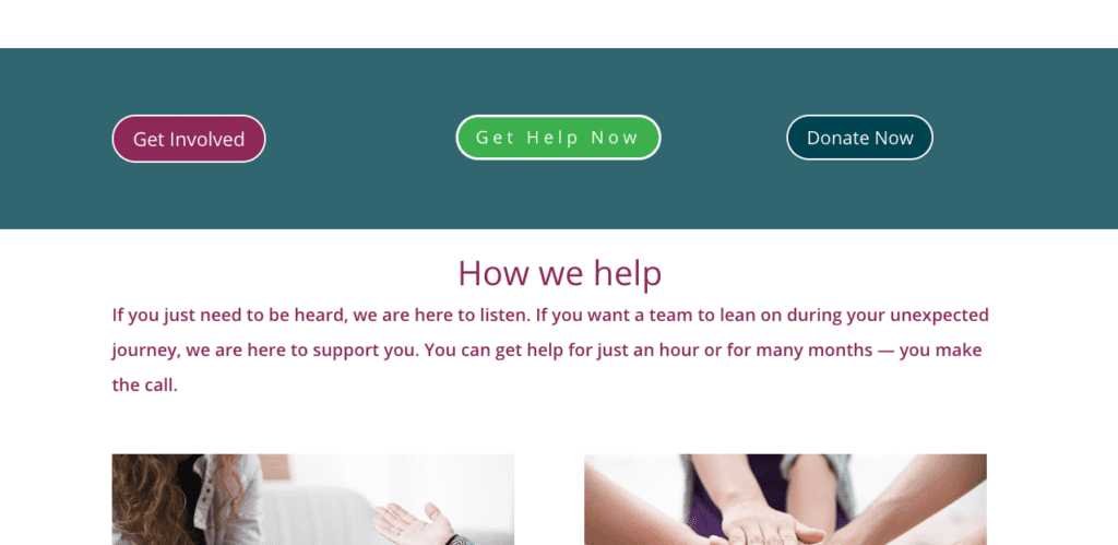
This therapist website example is a little bit different because In Shifra’s Arms is a non-profit that provides counseling to people who need it, and again I’m a little bit biased here because this is one that I’ve designed. But I did want to include it because I think this is a good example of is the way that you can speak to different audiences all within one website.
Things this website gets right:

Things this website gets right:
Look and Feel / Imagery. I love the colors on the site, and I also love the way that the images that are used both on the home page and throughout the site create a really warm feeling and a very uplifting and positive vibe.
Ease of navigation. One of the challenges with this website was to make it very accessible to the people that this organization serves, but at the same time have the site also be appealing and set up to interact with people who are interested in donating to their nonprofit, or who are interested in volunteering. In order to accomplish this, we created different paths for different types of users to all have a positive experience and be able to easily navigate to the parts of the site that were relevant to them.
- Relatable video. Included on the homepage of this site is also very powerful and well-made. It does a good job of explaining the purpose of this nonprofit organization and it is short and easy to follow.
#7 Thrive Works Therapy
The Thrive Works Therapy Website is a very interesting therapist website example, and I wanted to include it in part because it does something that I wouldn’t necessarily recommend, but it actually works in this case and I think that the in the end the effect is very powerful.
Things this website gets right:
- Video Background. I wouldn’t normally recommend having a video that plays as the background for your hero image. The reason for this is partly because it can really slow down the load time for your website. But, in this case, they did it and it actually is very effective, proving that there is an exception to every rule! The different videos that they show are short they don’t slow down the website. Instead, the images are dynamic and engaging.
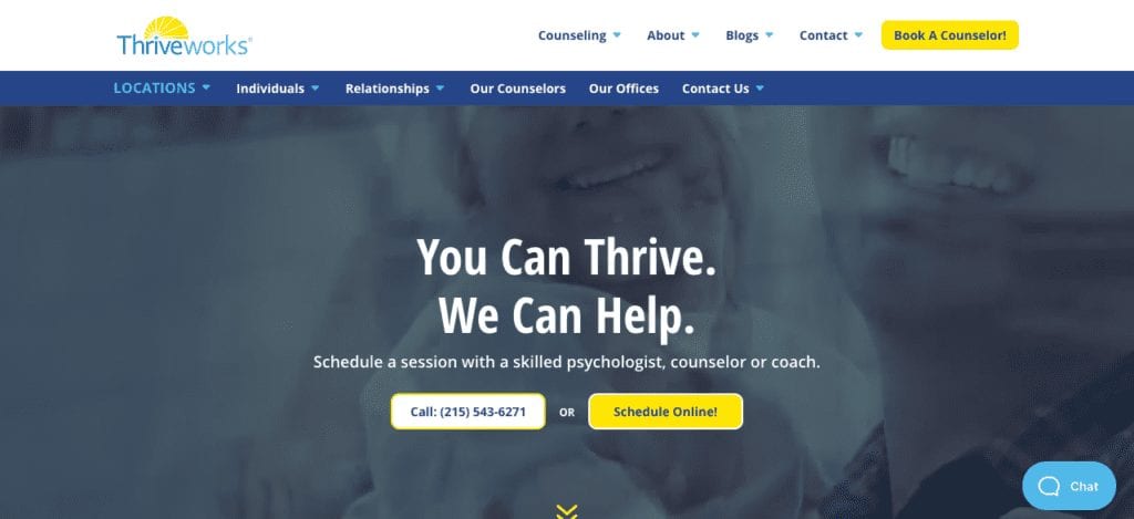
- Dual call to action right in the header. They also do a great job with having a dual call to action right there in the hero image. They have one button inviting people to call the office, and another button for scheduling online. What’s great about this is that there are a variety of different people who are going to come to your website. Some of them are going to want to talk to a human being, and some of them are going to not want to talk to human being, and others will want to do everything through the computer. So, I think it’s really great that they realize this, and that they have two different ways for people to contact them right there in a central spot when you first get to the page.
- The chat option. This is the only therapist website on this list that actually has a chat option on their website and I think that that is really great. Chat boxes increase engagement with website visitors by a huge percentage and having it as an option on this site makes the site a lot stronger. The one caveat that I will add,(and this is a big one) is that if you’re going to have a chat option on your website you have to actually make sure that you have someone who is answering those chats, and he or she is being very diligent to be responsive to people contacting you through that way. So, it’s something you can only do if you have the resources and the staff to really be able to keep that current and provide that service consistently.
Things this website could do better:
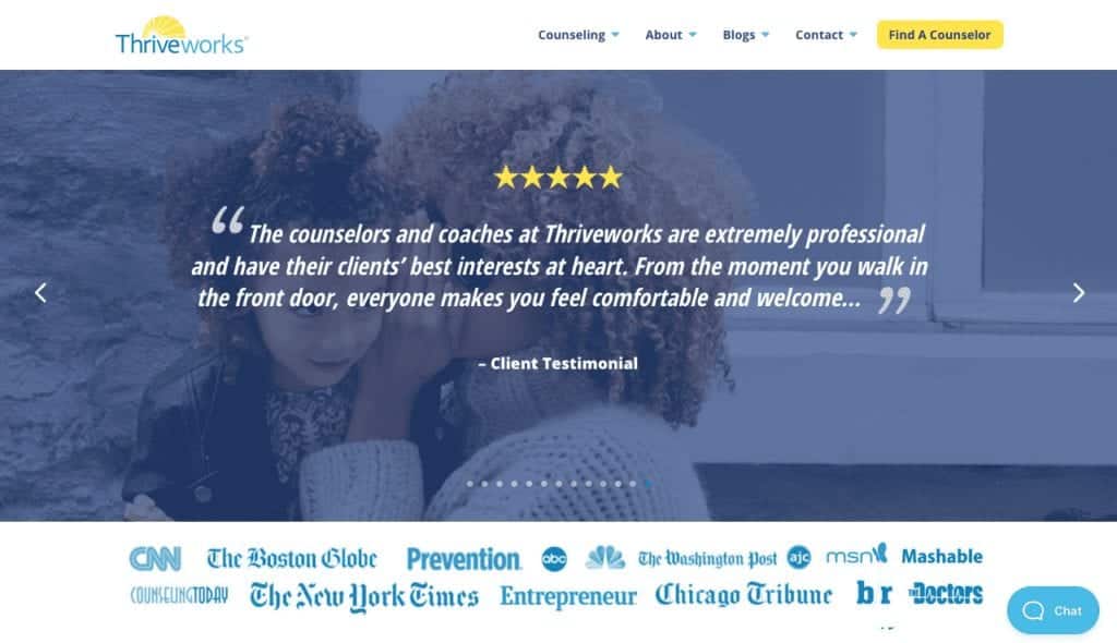
- Remove at least some of the logos. There are some other things on this home page that I think aren’t quite working. One of them is that they have a lot of logos of different media outlets listed on the home page, and I don’t think they’re going to see much benefit from that. First of all, I’m not sure exactly what these logos are meant to represent. Maybe they’ve had therapist that has been interviewed by these different media outlets? It isn’t clear, which is a problem, but beyond that I think that to the vast majority of people who are coming to the site to seek counseling, those types of logos are not going to build authority or increase trust. Instead, the logos seem out of place, and I would really suggest removing them, or at least reducing the number.
- Focus on a few strong reviews. Social proof is definitely very important. And the fact that they have reviews is really wonderful because a lot of therapists and counseling centers do really struggle to get reviews, due to confidentiality issues. But right now the website is displaying a very large number of reviews, and some of them are actually not that strong. Some of these reviews say things like, “I’ve only been there once but so far so good!” which is not exactly a ringing endorsement. I would really suggest that, instead of having what I think is probably a widget that is automatically pulling reviews from Yelp or some other online source and then automatically posting them, to instead pick a few reviews that are very strong and feature those.
#8 Ground Work Play Therapy
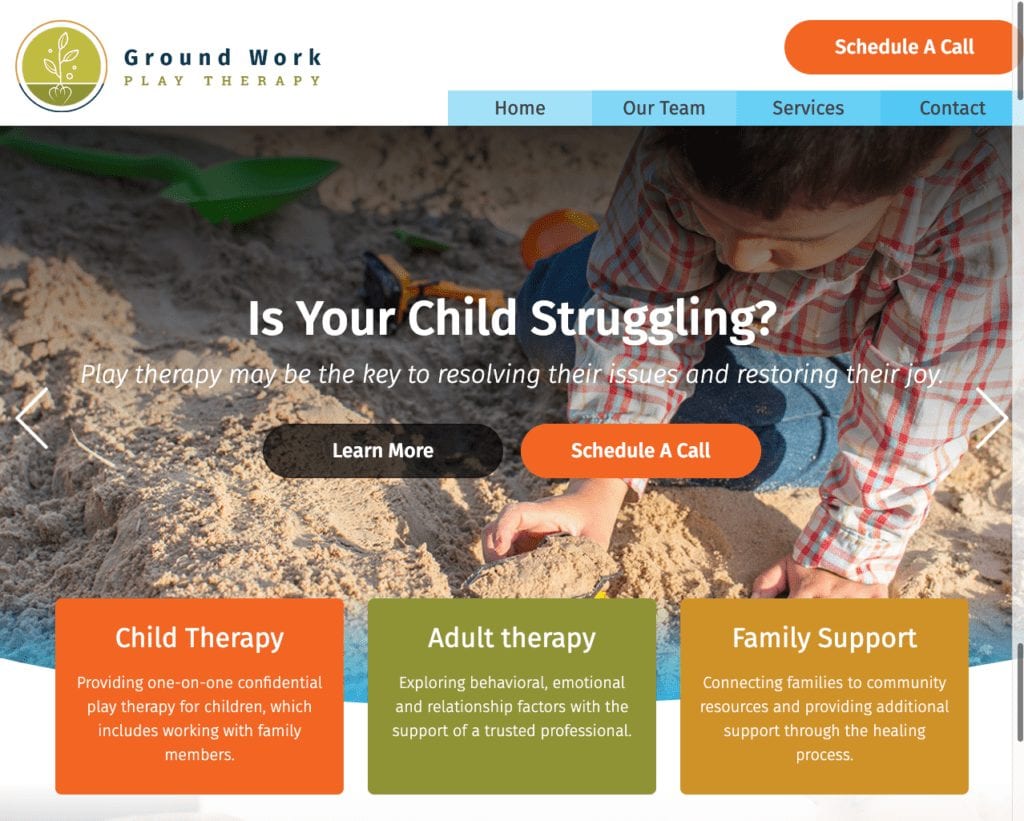
The Ground Work Therapy website is doing a great job of communicating with their audience. Right off the bat we can see that the bright colors and lively feel of this website conveys this practice’s personality and fosters a friendly, playful feel. They also choose a great hero image that really conveys what the unique focus of this practice is.
Things this website gets right:
- A great call to action with two options right in the header give website visitors and immediate and invitation to take action.
- The three categories break down clearly what services they offer, and show right away that this practice is not just for kids.
- The “schedule a call” button appears both in the main hero image and also at the top of the whole page, which is great. We want to give people multiple opportunities to click that button to get in touch.
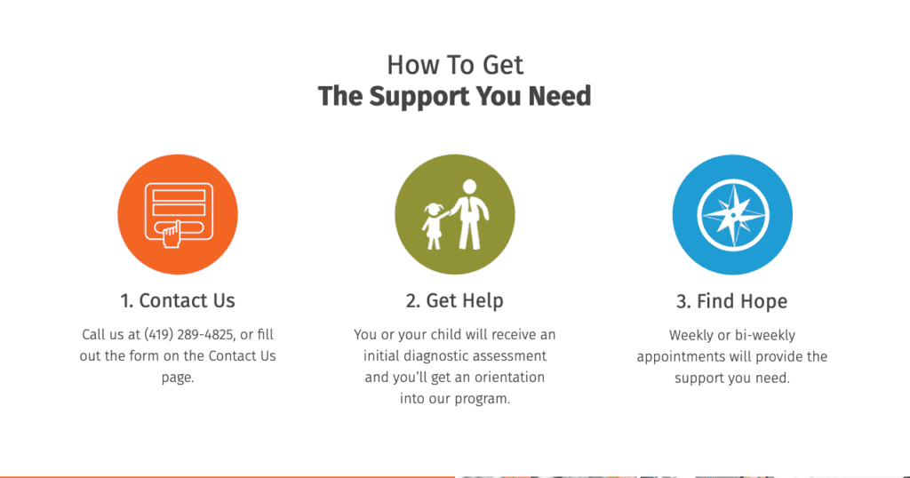
- I love the way they break down the process of getting in touch and starting treatment with them in a visually dynamic way. It helps take the feeling of overwhelm out of the decision to get started and is a great way to encourage potential clients who might be feeling overwhelmed.
Things this website could do better:
- Make it more personal Overall, I think that this website gets a lot of things right. The one place where I feel like they unfortunately really miss the mark is with personalization. They don’t have an “about us” section, and about us pages are often the most-visited section of any website. Especially when you are asking people to trust you with their children’s problems, creating a sense of trust is important, and you can’t really do this without telling a little bit more about yourselves. This is especially clear in the “Meet our Team” section, where there are no pictures posted of the various professionals working at this practice. This is a mistake I see often, and it really is a big one. Being camera shy is okay in your personal life, but on your website you really want to help people establish a sense of trust with you, and there really is no substitute for photos of the therapists working there.
#9 Couples Learn
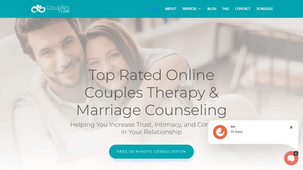
There are so many things that this website gets right and the first thing about it I love is the colors the color palette here is just lovely it’s really well done it really is on target for the topics that the website is addressing and the combination of the Blues the greens and the purple really make the website feel very alive and very dynamic.
Things this website gets right:
- Clear Messaging Another thing that this website gets right is the very clear messaging. At the top they explain the kind of therapy that they offer, and then they talk about the benefit that their therapy will bring to the people who come to them, giving a concrete and relatable benefit by saying, “increase trust intimacy and connection in your relationship.” Immediately below that you see they have a call to action where you can sign up for a free 30-minute consultation. Overall, the strategy and copywriting on the site are really strong
- Video As you scroll down the home page they have a video which introduces their practice. This is a great thing to have and I encourage more therapists to consider this. Having a video on your website is a great way to increase engagement. People tend to be very motivated to click play, they often just want to see what happens, and videos engage in a way that just plain text doesn’t. Especially if you make sure to have captions on your videos so that even if a person is in a public space they can turn down the sound to just watch with the captions, videos are a powerful tool to use on your website.
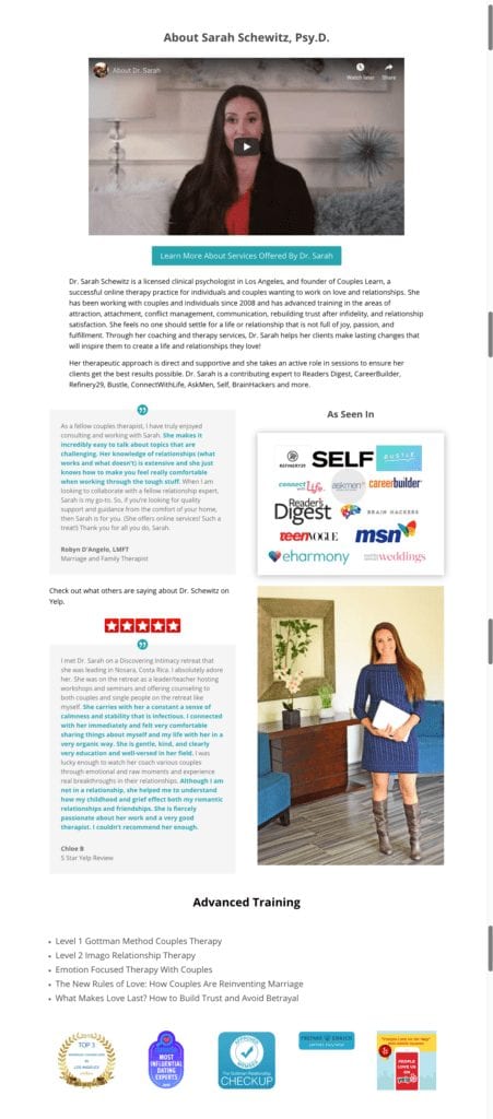
- Building Authority and Trust You can see that there are several ways that they focus on building authority and trust. They have a few Yelp reviews but, unlike a previous example that we looked at, you can tell that these reviews have been curated. These are all five-star ratings that are in-depth that actually give potential customers information about what the experience of working with this practice is like. They also have information that reassures website visitors that they are HIPAA compliant. This is especially important when you’re doing any kind of online or Telehealth service, and having the HIPAA compliant seal right here is a great choice.
- Strong About Page The About page on this site does a really good job of accomplishing something that many people struggle with: it strikes a good balance of explaining the practitioner’s expertise, education, and and clinical approach, all without being overly technical or reading like a resume. This About page is very accessible, especially with the inclusion of a video, as well as more reviews and recommendations from past clients.
Overall this is an extremely strong site, and one that I don’t have recommendations for improvement.
#10 Individual and Relationship Therapy Center
For our last therapist website example, we’ll be looking at the website for Individual and Relationship Therapy Center in Denver, Colorado.
This website does a lot of things right, starting off with the very top of their home page.

Things this website gets right:
- Contact information. They’ve got all the relevant contact information right at the top, and you’ll notice that they give several options. Clients can call, email, or schedule online. This is great as it ensures that, no matter which mode of communication makes clients most comfortable, they will have an easily accessible option.
Value message and call to action. I love that they use the central text in their hero image to first validate their clients struggles with teh statement, “Relationships are hard.” And then they follow this up with the hopeful encouragement to, “Reclaim the joy in yours!” What’s great about this is that they are using strong, emphatic language that empowers their clients.

Great About Section. I love the way they present their about section, and the picture in this post can’t even fully convey how clever this is. But they have high quality, professional photos of their practitioners featured right here on the home page. Even better, when you scroll over the pictures, they switch to a photo of that practitioner as a child. I think this is a brilliant way to make the therapists feel real and human, and to help potential clients to not feel threatened by the idea of reaching out to them.
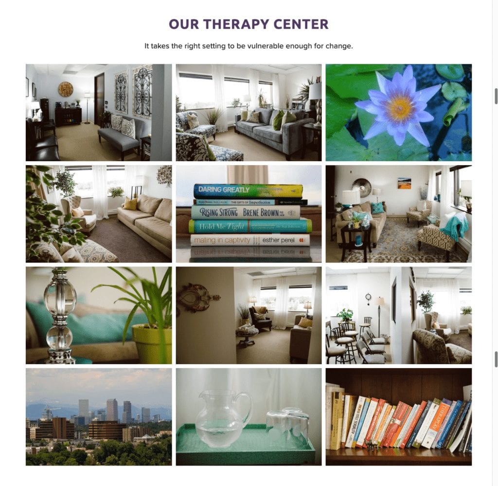
Great photos of their office. Another really smart move on this site is that they include a number of really lovely photos of their office, to give people a real sense of how warm, inviting, and lovely the office is and make it easier for potential clients to imagine themselves being there.
Things this website could do better:
Colors. Colors and patterns are highly subjective. However, I feel that the bright purple pattern behind the images on the home page is quite jarring, and would recommend a different background pattern.
Button Animations. In general, it is a good idea for websites to respond to the actions of the website visitor in small subtle ways. When a visitor places their mouse over a button, the button’s appearance should change slightly, to show that the page is aware of their action and that the link is live. It also is more likely that people will click on buttons that are responsive.
Feature the lead magnet! This site has a lead magnet, which is great!! However they hide it down at the very bottom or their home page. I would think they would get more benefit by placing it up near the top!
How can we help YOUR practice grow?
FULLY-CUSTOM WEBSITE: We'll create your website content, and design a custom website just for you!
SEO: Rank higher in search results with Search Engine Optimization.
Conclusion
I hope you’ve found this exploration of therapist website examples really helpful, and that it has generated some good ideas for you about your own site and what you might like to do to make it stronger!
If you want to create a successful therapist website, contact me for or schedule a FREE discovery call. You can also sign up for my free video course on the Secrets of a Successful Therapist Website.
Now I’d like to hear from you.
Which of these sites do you think is the strongest?
Do you know of another great therapist website that ought to be on this list?
Leave me a quick comment to let me know!
Did you like this post? Share it!
Related Reads for Website and Branding Inspirations
- A Unique Website for Family First | Behind the Scenes
- A New Digital Home for The Comfy Place
- The Best Therapist Websites of 2022!
- Ten Great Therapist Website Examples
- Psychologist Website Design Trends 2023
- 6 Things When Creating Video Content For Your Business and Therapist Website
- 12 Future Proof Tips: Website Design For Small Businesses And Therapists
- Web design for Counselors
- Engaging Psychiatrist Website Design
- Copywriting for Therapists Example- Therapist Website Design
- The Best Website Hosts For Small Businesses and Therapists
- How to Create Effective Therapy Website Tagline for Your Practice
- Professional Website Fonts: Choose the Right Typography for Your Therapy Website
- Branding And Therapist Logo – Use Your Therapist Logo Consistently
- Logo Designer – Looking for a Professional Designer
- Therapist Logo Ideas – Find Inspiration in the World Around You!
- Different Logo Types for Therapist Business Branding
- Benefits of a Logo for your Therapist Branding
- Therapist Logo Design – Define Your Brand Identity
- Is It Worth Making a Website for a Small Business?
- Why Doesn’t My Website Show Up on Google Search? Common Issues and Fixes
Need any of the following?
Here are some Sample Websites We’ve Created:
- Website Design For Consulting Business
- Psychotherapist Website Example
- Private School Website Design
- Websites For Counselors
- Counselor’s Website Example
- Website Design For Small Business
- Design
Check out our Portfolio for more!
Hi! I’m Sarah.
I help counselors and therapists have a bigger impact on the world through better client connection. I do this by creating beautiful visuals and strategically designed websites.


11 thoughts on “The Top Ten Therapist Website Examples!”
Wow, honored to be included here!
I really love your site, and am so glad that I could include it here!!
Hi Sarah,
Thank you for putting this list together. My wife just published her website. It’s got an incredible design and should definitely make it on the list. Check it out. I would love to read your opinion!
Best regards
Juri
Juri – so glad you enjoyed the list, and thanks for the recommendation – I will check out the site!
Hello Sarah,
I’ve been looking into creating a website for my psychotherapy practice. I’ve been working at a non-profit and will be moving soon and therefore, opening my own practice. My business name is Holistic Counseling Services, LLC. I don’t have an address yet as we are still looking for the new home.
Please let me know your fees.
Sincerely,
Kate Kestle
Hi Kate, thanks so much for asking! You can get a sense of my fees by looking at my pricing page here: https://strongrootswebdesign.com/pricing/. Also, feel free to set up a discovery call – I’d love to speak with you and learn more about your practice. Thanks!
-Sarah
I enjoyed this list. I am looking for ideas for how to design my coaching website. I was impressed by #1 and by #5. Your observations are insightful and constructive.
Thanks so much Jill! I’m so happy you found this helpful. Best of luck with your coaching website!!
Thank you so much for your critique and recommendations! It helped me build my new website into something much better than I had before. I’m so grateful.
That’s fantastic Zoe I’m so glad!
Begin Counseling is a trauma therapy practice based in West Virginia. The website is built in WebFlow and utilizes images from nature taken from local, regional areas. Each hero image transitions from monotone to including a colorful a ray of light – visualizing that, “At Begin, we are your trusted guide through dark times. Things will get better.” Take a look: https://www.begincounseling.com/