“There may be images that you as a person like--However, it is important to keep in mind if that imagery represents the vibe you want to give off to others. If you want a strong vibe, or soothing vibe, the elements of your logo and branding will need to match that.”
--Logo Designer Malkie Scholnick
The different logo types can be categorized into seven major categories. Each one has its own history, tone, advantages, and challenges in its use.
- Emblems
- Wordmarks
- Monograms (Letter marks)
- Brand Marks
- Abstract Logomarks
- Mascots
- Combination Marks
Why Does Different Logo Types for Your Business Matter?
A logo has an amazing range of benefits for your therapy practice. However, you only reap these benefits if the logo resonates perfectly with your ideal clients and investors. It is not enough to simply pick an image. You must think of everything that goes into that image. You have to think of what they convey to patients and investors.
The type of logo you choose makes a HUGE impact on its efficiency. It is a visual representation of your business. A concept given a visible form. Every logo type has its own tone, message, and challenges in use.
What Are Emblem Logos?

Emblems are among the oldest form of logo. They are less formally known as seals or crests, and people have used them to mark their wares since ancient times. It holds things like the company name, establishment date, or a brief motto within an image. A few notable examples are the older Starbucks and Harley Davidson emblems.
Emblem logos (such as the Starbucks logo) almost always represent a traditional look and quality. They represent professionalism and longevity, and they tend to need the least updates of the seven types.
If your ideal clients prefer more traditional and serious atmospheres, this could be a good fit for your therapy practice. Just keep in mind that emblems are hard to scale due to their complexity. Especially in tiny images like favicons or social media post avatars. Also, while there are exceptions, it is difficult to give off a relaxed or family vibe with an emblem without looking loud and cluttered.
What Are Wordmarks?
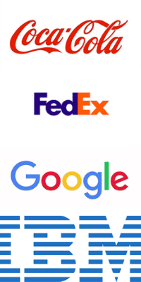
Wordmarks are a logo built out of the company name. Instead of a visual image, you rely on topography. The font, layout, and colors all work together to link your therapy practice name with a tone.
A key advantage to this logo type is it strongly ties your brand to your business. Disney+, Facebook, and Google are strong examples of this logo style. When you see the logo, you can not mistake which business it belongs to.
You might want to consider the wordmark if you:
- Are a new practice, and you are still getting your name out there.
- Your name is your brand (Dr. Smith’s Behavioral Therapy)
- Your business has a short name
Wordmarks do have their challenges. First, you MUST choose your font carefully. A Wordmark depends heavily on both tone and readability. And sadly, fonts have limited lifespans. You will have to update your font to avoid looking outdated. You will also have to account the costs of replacing anything with your old logo printed on it as well.
You might also want to avoid a wordmark if your business has a long name. A long name is difficult to scale and read from a distance. Also, it can look cluttered and overwhelming in product designs. While a wordmark is not impossible, you will face extra challenges in a good design.
What is a Monogram (Letter Mark) Logo?
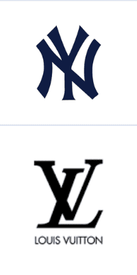
A letter mark, or monogram logo, takes a name and focuses it down into initials or an acronym. Some notable letter mark brands are H&M, 3M, HBO, and Gucci’s symbolic G.
Letter marks depend heavily on topography and font like wordmarks do. But they also tend to be easier to identify and use than your full business name.
Letter mark Logos are a good alternative to wordmarks if your therapy practice has a long name. But keep in mind that it is not as strong an association with your business name as a wordmark. If you are starting a new therapy practice, you may need to attach your business name below it for a time as you build an identity.
What is a Brand Mark?
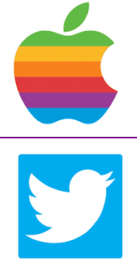
Brandmarks are a visual image that represents your brand. They tend to be a literal interpretation of your business. For example, Apple’s iconic logo or Twitter’s blue bird to symbolize their ‘tweet’ message system. Some are less literal, but they evolved from an emblem or wordmark logo over time, such as Disney’s castle logo or Starbuck’s two-tailed mermaid.
A Brandmark can be a great option if:
- You need to evolve a more complicated existing logo into something more modern, scalable, and marketable to a specific audience.
- If the focus of your therapy practice can be drawn literally (such as a bed for sleep therapy, or a ball and swing for play therapy).
- If your practice name can be given a literal visual translation. For example, the online self-healing and counseling site “Seven Cups of Tea” uses an icon of a steaming teacup.
Brandmarks come with their own challenges. They can be great for marketing and product design, but less identifiable to new patients. You must market more to associate the symbol with your therapy practice. There is also the issue of tone. It is not impossible to create a traditional and serious tone if that is your clientele, but it is more difficult to achieve such tones with the logo type.
What is an Abstract Logo Mark?
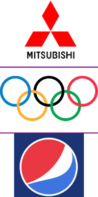
Abstract logo marks are like brand marks. However, they do not convey a literal symbol. The image is meant to convey an impression or feeling rather than a literal interpretation. Some well-known abstracts are the Mastercard logo, the Mitsubishi triple diamonds, and the five rings of the Olympic games.
When you want a more serious visual image for your logo than icons can portray, an abstract mark is a great alternative. It allows you to create an image that is unique and memorable, and it also scales and prints well on promotional materials and stationary.
The big challenge is identity. You have to do a lot of marketing and social media exposure to tie an abstract image to your therapy practice name. It is also not a great idea if you are still solidifying your brand identity. Abstract marks are designed to convey feelings. You have to know the feelings and messages you want to evoke first, or you won’t convey the right tone and message to your ideal clients.
What Are Mascot Logos?

Mascots are a character that represent your brand and therapy practice. They focus on our human desire to connect to a figure or personality- even if that figure is a peanut, an anthropomorphized tiger on a cereal box, or a duck selling car insurance.
The mascot logo is more flexible than traditional logos because you can vary the design and it will still be easily identifiable. You can give the mascot different expressions and poses without losing your brand identity on marketing materials. It is a great option if you specialize in families and children, being the focus is being friendly and approachable.
The big danger in mascots is they can be TOO friendly and comical, and this can hurt the professional aspect of your business if you are not careful. If you need a serious vibe, a mascot might not be the best option for your practice.
What is a Combination Mark?
Combination marks are by far the most versatile of the brand types. You simply combine two of the logo types above into one design. Unlike emblems, the words and images in the logo can be used separately from one another. One example is the Pixar moon logo- they can use the full logo OR just the text OR just the crescent moon image in their marketing and branding.
This allows you a great deal of versatility. You can attach a name to your icon on your office door but limit it to the image in a website favicon. You can use an emblem for an amazing business card, and the name on the take home reports and stationery.
If you are just starting out, a combination mark is a good way to combine your business name (wordmark) to one of the others, then gradually phase the wordmark out as you gain a reputation. It is also great if you need a lot of flexibility in reaching out to people over multiple platforms.
Keep in mind that the combination logo is still challenging to use. It still shares the same perks and challenges as its individual parts, so you must consider their usage carefully. A combination logo can also look very loud and cluttered in its original format. Finally, a combination mark is subject to regular revisions to keep it fresh and relevant to your audience.
There are several things to consider when choosing one from these different logo types for your therapist business. You can narrow down your choices by considering a few of the following:
- How would this logo type look on my desk or office door? Can people see and understand the central focus of my therapy? Is it different enough from other therapy practices to stand out?
- Does it represent the problem I help people solve? Does it represent how I solve these problems?
- How will this type of logo appear on my business cards, stationary, and mailing materials? Will it convey the tone I want? Will people know it is connected to my therapy practice at a glance? Will it be consistent with the rest of my brand strategy?
- What thoughts and emotions will someone feel when they see this logo? Is it the style that attracts customers I want? Is it serious and traditional? Does it attract families?
- Will it link to my therapy practice? Is it too abstract? Do I still need to build my business name with the local area?
These are a few major considerations that will help you narrow down your choices. You do not have to do this alone though! A professional logo designer can help you choose among the different logo type and find the perfect logo style that will be consistent with your brand and resonate with your audience.
Next, we’ll explore how to go about how to find inspiration for your logo!
Related Reads for Starting and Branding Your Practice:
- Branding And Therapist Logo – Use Your Therapist Logo Consistently
- Branding Your Mental Health Private Practice
- Professional Website Fonts: Choose the Right Typography for Your Therapy Website
- Counseling Practice Names for Branding and Website
- Photos for Your Therapy Website | Counseling Stock Photos
- Logo Designer – Looking for a Professional Designer
- Benefits of a Logo for your Therapist Branding
- Therapist Logo Design – Define Your Brand Identity
- Therapist Logo Examples – Inspiration for Therapist Logos
- Therapist Logo Ideas – Find Inspiration in the World Around You!
- Different Logo Types for Therapist Business Branding
- Your Therapist Logo: The Ultimate Guide – Therapist Website Design
- Tools for Small Businesses: Low-cost Social Media Tools For Your Biz
- User-Friendly Website Templates For Therapists
- Web design for Counselors – Private Practice Websites
- Web Design for Psychologists: A simple guide – Therapist Website Design
- Website For Forensic Psychology Practice –4 Factors to Consider When Choosing the Best Mental Health Website Design
- 4 Ways to Identify Web Design Goals for Your Therapy Website
- How to Choose Your Therapy Niche and Get More Clients
- I Want a Website for My Business: A Beginner’s Guide to Getting Started
- Affordable Web Designers for Therapists: Expert Solutions Guide
- Affordable Website Development for Counseling Professionals
- Tips on Website design for Mental Health Professionals
Need any of the following?
- Web Design And SEO Services
- Done-For-You Therapist Website Template
- Professional and Customised Web Design
Here are some Sample Websites We’ve Created:
Check out our Portfolio for more!
Hi! I’m Sarah.
I help counselors and therapists have a bigger impact on the world through better client connection. I do this by creating beautiful visuals and strategically designed websites.


