The Best Therapist Websites of 2022!
I’ve gotten so much interest in my earlier post “Ten Great Therapist Website Examples” so I’ve decided to create a new and updated post on the same topic for 2022! Including examples of therapists websites from private practices, child therapists, group practices and physical therapist websites, read on to get some great inspiration and insight for your own website.
Therapist websites have to do a lot of things effectively, all at the same time.
Your website needs to attract the right clients, communicate with them effectively, and demonstrate both your understanding of the problem your potential clients are experiencing AND that you have the required expertise to help them.
If that feels like a whole lot . . . you’re not wrong.
So here is a list of the Best Therapist Websites of 20220 to provide you with ideas and inspiration for your own website!
As before, though this list is numbered 1 – 10, the entries are not in a particular order or ranking – these are all great sites that should be good sources of inspiration.
Let’s dive in!
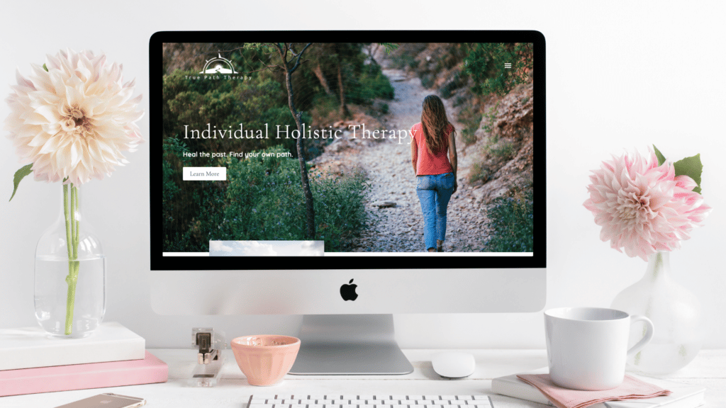
Table of Contents
#1 Octave Therapy
First on our new 2022 list is the beautiful Octave website.
Let’s take a minute here to talk about all the things that this awesome website design gets right.
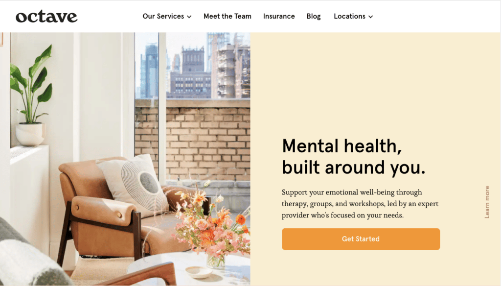
First off, can we talk about these colors?!
I absolutely *love* how bright and cheerful this site is – and if you scroll through the Octave website you’ll see that those colors are consistent throughout the site. These colors communicate hope and are a beautiful, eye-catching foundation for the rest of this effective website.
Other things this website does right:
- Imagery: The custom imagery used throughout this therapist website give you a real glimpse into the warm, welcoming space they have created here.
- Layout: The website is well organized, and you can easily find the information that is relevant to you. There’s no need to scroll through long pages searching for what you need.
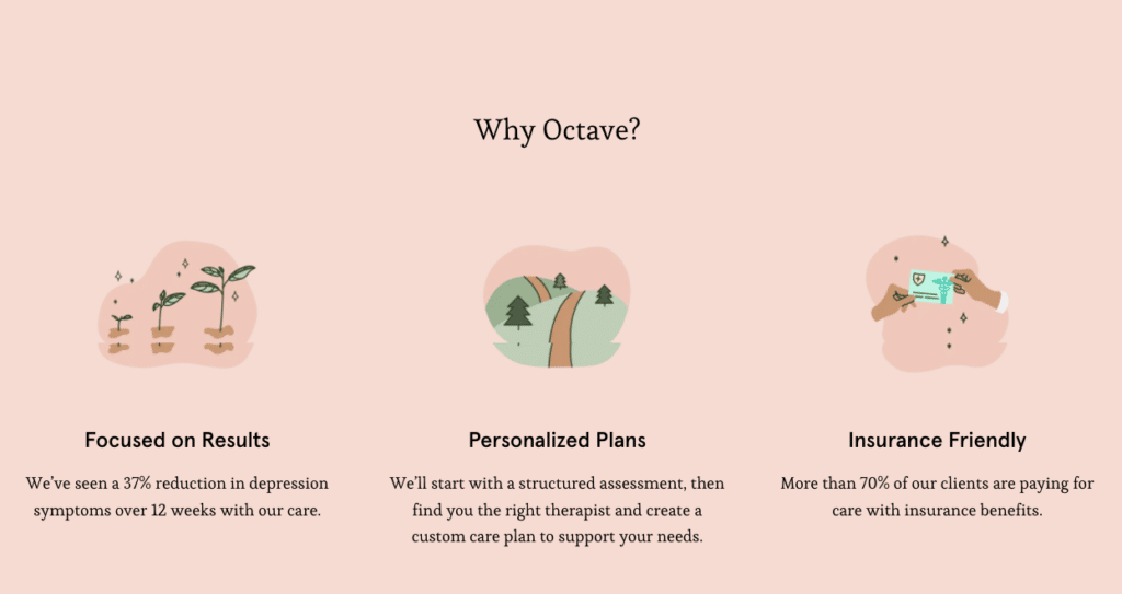
- Custom graphics and Clear messaging: They do a great job of combining some custom graphics with really top-notch copywriting, to communicate what makes this practice special and unique.
- The Book Now Button: the unobtrusive “Book Now” button in the top right corner makes it easy for those who are ready to make an appointment to immediately take the first steps to getting in touch.
How this website could be improved:
- Reduce the Overwhelm: It can be difficult when there is a practice with many people working at it, to incorporate all the bios in a way that avoids overwhelming the website visitor. I’d recommend a re-vamp of their “meet our team” page to make that section a bit more user-friendly.
- Newsletter: As far as I can see, this site does not have any sort of lead magnet or offer of a newsletter sign-up. It’s always a great idea to have that as an option for those who aren’t quite ready to get in touch. It helps you stay in touch with them until they are ready to move forward, and especially for a large practice like this one makes a lot of sense!
You can check out my video review this website here:
#2 Incredabilities Occupational Therapy Website
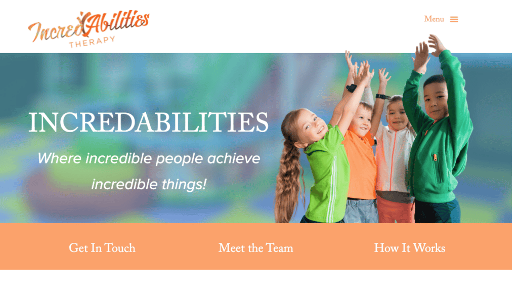
The Incredabilities website is one I designed, and there are several reasons it is included in this list of the Best Therapist Websites of 2022. I loved everything about this project: from the absolute dedication and expertise of Ricki and her team, to the adorable kids in the pictures, to the bright colors, everything about this site communicates that it is warm, exciting, and kid-centered.
Things this website gets right:
- Ease of Finding Information: That bright orange bar under the hero image breaks down the options right rom the start, offering people the information that they are most likely to be searching for – how to get in touch, who is on the team, and the process to get started. Offering ease of access to important details like this is a great way to make your site user-friendly!
- Movement: Appropriate for a site that is all about getting kids moving, there are small animations throughout the website that create a dynamic feel. The animation catch the website visitors eye and keep them interested, without being overwhelming or distracting.
- How to get Started: Since new clients often don’t know where to start, this Occupational Therapy Website includes a four step break-down of how the process works, so that parents can know what to expect from the beginning.
- Resources Section: Ricki takes the time to do something I wish more people would do – she creates a really in-depth resources section with lots of the books, toys, and other resources that she often recommends to parents included (and even linked to amazon!) This is great for a number of reasons. First of all, it saves her time – she won’t have to email the same information to parents over and over – she can just refer them to her site. And second, it really demonstrates her expertise, and shows just how much she knows. Offering valueable information like this for free is a great idea, and a great way to create traffic to your website!
Are you ready to create a fantastic website of your own? Click here to learn more and get started!
#3 Bellatore Eating Disorder Recovery
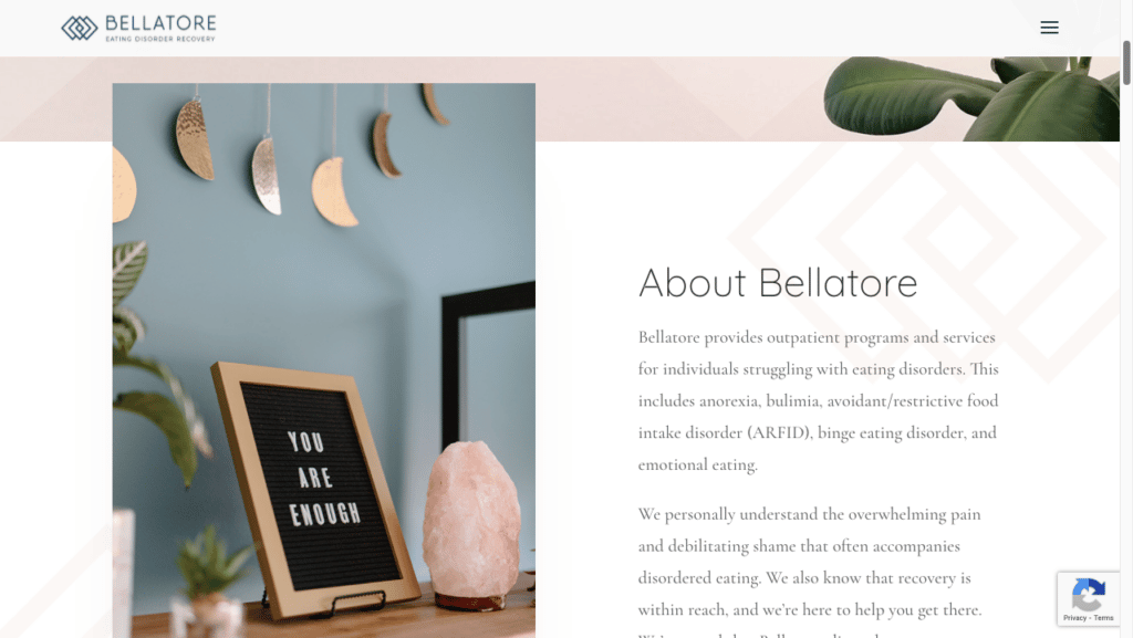
Sophisticated, polished, modern – all of these words come to mind when you visit the Bellatore Eating Disorder Recovery website.
Let’s take a closer look.
Things this website gets right:
- Design, Colors, and Layout: There is so much going right here! The colors, the motif of the logo that gets repeated subtly throughout the site, and the way the images overlap the sections – the design here is well done, sophisticated, and gives the whole site a professional, polished feel.
- Video introduction: This is a great example of how a video can do a fantastic job of making it easy for potential clients to get a real feel for who you are and what you offer. It also helps give you a sense of what the guiding principals and ideas that make this group practice cohesive.
- Custom Images: Again, we can see here how effective custom images can be. They really make the site feel bespoke, and help convey the upscale feeling that the site is trying to convey.
How this website could be improved:
- Consider making contact information more prominent: It’s always a good idea to have your phone number, or a contact button, right at the top of your website. First of all, some people who come to your site already know that they want to contact you – they just want to find out HOW. The last thing you want to do. is frustrate those people by forcing them to scroll around your website. Secondly, at any time that a website visitor decides they want to get in touch – you want it to be extremely easy for them to do just that right way. Putting a contact button or phone number at the top of every page is a great way to accomplish both of these things.
- Too Upscale?: It may be intentional, but overall this site has a very up-scale feel, and it is likely that some potential clients will not get in touch for this reason. For some practices this can be appropriate – if you offer boutique services, you may save yourself time if you communicate that up front so that people who are not looking for that don’t call you. But it is something that should be done carefully!
#4 Alexandria Art Therapy
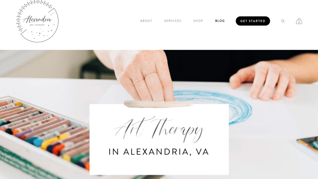
I really wanted to include an Art Therapy website on this list, and was so happy when I found the Alexandria Art Therapy website! They have a great hero image here, which introduces us to their practice and is welcoming and colorful. You’ll notice that there is a lot of white space on the site, which allows the artwork, when it’s used, to really stand out.
Things this website gets right:
- Inviting Pictures The pictures used here do a great job of inviting people to make art rather than to admire it. Because. the focus in art therapy is on the process rather than the product, the pictures need to feature the art supplies rather than the finished art work. The images make you want to grab some paints. and start creating!
- What We Believe Statement The home page features a statement of the principals and beliefs that are the foundation of this practice. Having a statement like this is a great way to communicate to potential clients what you care about and helps them get a sense of who you are.
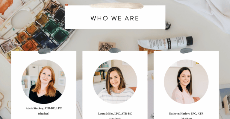
- In-depth staff bios: Both on the homepage and on the individual staff bio pages, they do a really great job of going in-depth and giving people a really good sense of who each practitioner is, what they specialize in, and what makes them special. The photography is great and makes the practitioners seem like real people who are super approachable.
How this website could be improved:
Services pages: The main thing that I would suggest looking at if you wanted to make some improvements or changes to this website would be the Individual Services Pages. What they’re doing right now is that the services pages just direct you to whichever practitioner provides that particular service. I think that some people will feel a little bit confused when they go to for example, an individual therapy page, and rather than seeing an explanation of what happened in individual therapy or how individual therapy can help, they basically see lists of names to then go to those individual staff bios and learn about how that individual might be able to help you. I think that overall the site would feel more cohesive if you broke down the different services that are provided, talked a little bit about what that service is, who it can help, how you approach that kind of treatment, and after that to give Information about specific practitioners who specialize in that and send website visitors to the practitioner’s individual bios.
#5 True Path Therapy
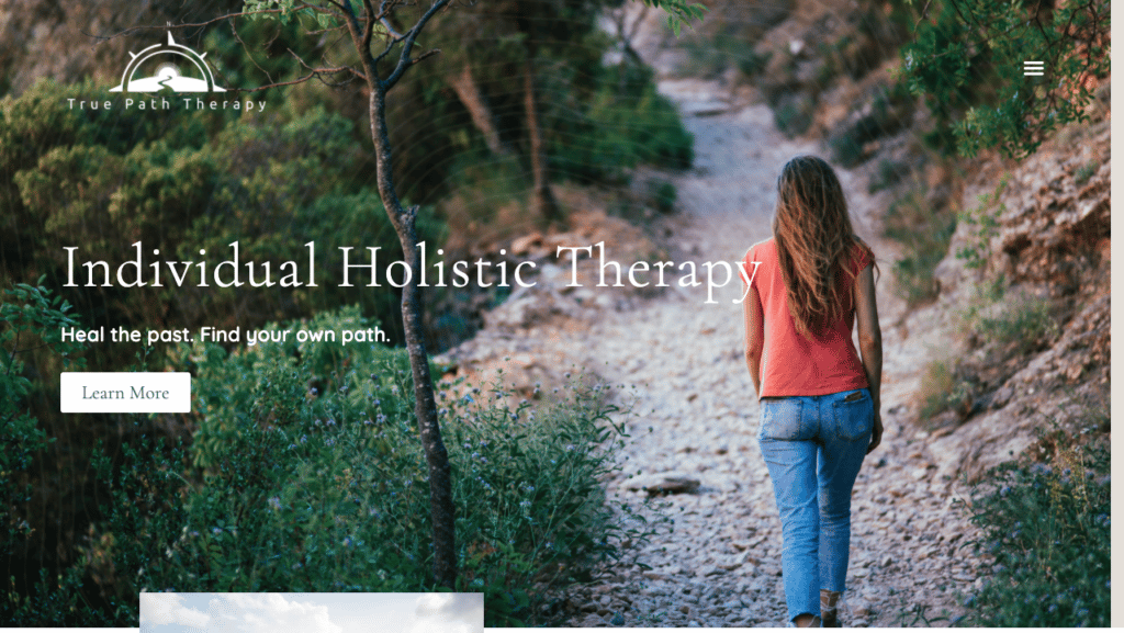
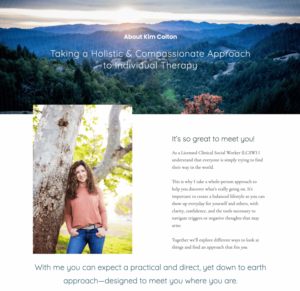
I loved working with Kim Colton on the True Path Therapy Website and I think it turned out to be a really great example of the way a solo practitioner can infuse their website with their personality, and really make the website have a central theme that helps website visitors to get the feeling that they’re really getting to know you as a person through your website. Let’s take a closer look at why this site is included as one of the Best Therapist Websites of 2022!
Things this website gets right:
- Creation of a central theme:The ideas of a journey, a path, and nature are woven throughout this entire site and they help both to communicate the message that Kim wanted to share with her audience, and also to give the website a really cohesive feel. Kim is a person who really connects with nature, she’s a runner, and additionally she really loves the idea that as a therapist she’s helping people to find their path. And so we took these ideas and we really infused the whole website with these concepts. And if you look through the whole site you’ll see over and over path imagery, tree imagery, and map imagery – which is all a part of this idea that Kim had about how she works with her clients, and the metaphors that she likes to use about the way that she helps her clients to improve their lives.
- Services Page: As a solo practitioner who didn’t want her website to be too large, we created for Kim a services page with separate sections for each of her specialties. As the website visitors scrolls down the page, we are introduced to all the different types of special services that she offers. Each has a brief description and you’re given just enough information to know how she can help, and to get in touch for more information.
You can check out my video review this website here:
How this website could be improved:
The inclusion of a lead magnet and newsletter signup would be a great addition to this website.
Are you ready to create a fantastic website of your own? Learn more here!
#6 Samantha Osborne Therapy
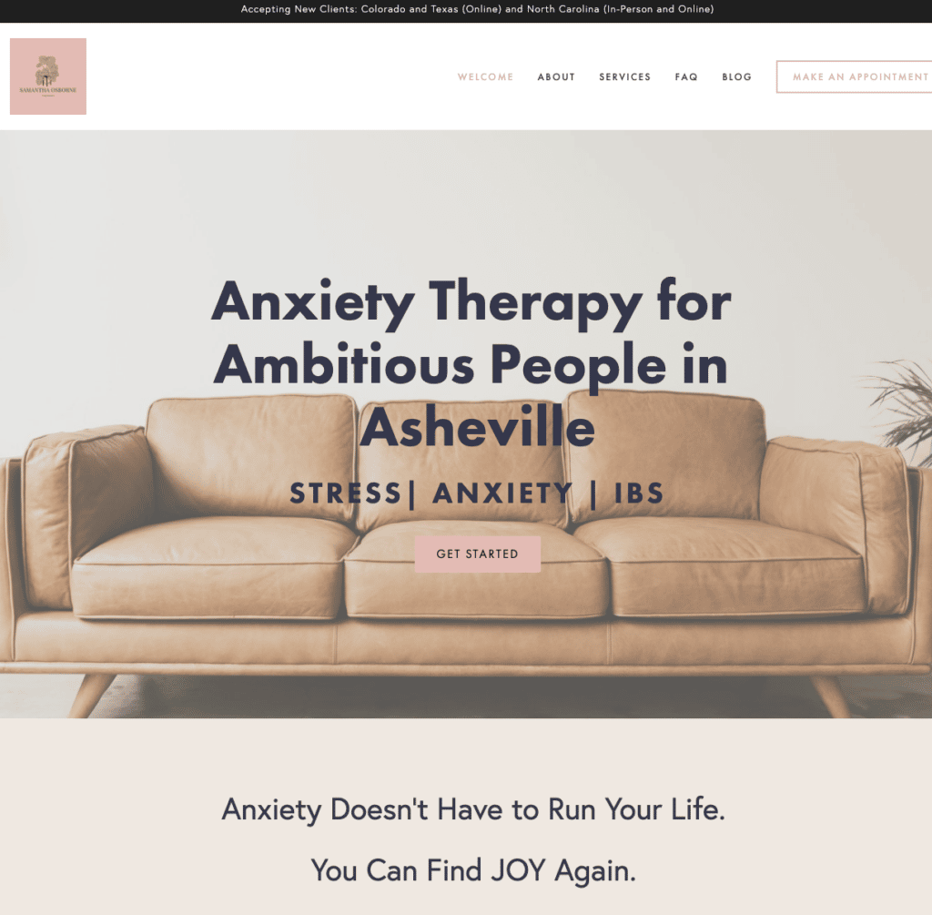
The site is beautifully designed, but the star of the show is the excellent niching that Samantha does! She communicates her very specific niche right up front, helping us understand *exactly* who she helps in the very first moment that we’re on the Samantha Osborne Therapy site.
Things this website gets right:
Things this website gets right:
Tagline: Samantha gets the niching right! Let’s break down her tagline. “Anxiety Therapy for Ambitious People in Asheville” She not only states clearly who she helps (anxious people), how she helps them (Anxiety therapy), but she qualifies this to make it more specific by adding “for ambitious people” and includes a location “in Asheville.”
She then takes it one step further by saying specifically the issues that she helps people overcome: stress, anxiety, and IBS.
Within in 3 seconds of landing on her site, you know if you’re in the right place. People who are not her ideal customer will move on (which is what you want) and people who ARE her ideal client will feel SEEN.
- It’s Easy to Get Started: From the “Get Started” buttons spread throughout the site, to the “Make an Appointment” button in the upper right corner, no matter where you are on this website, it’s always easy to take the first step towards getting in touch with Samantha.
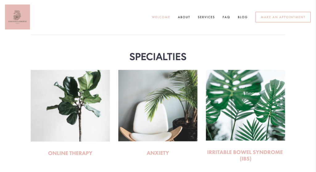
- Clean, bright imagery: I’m a huge fan of plants and greenery to help bring a site to life – and this site does a great job of using clean white space as well as the bright green plants.
- Excellent use of a newsletter signup and lead magnet: Samantha has a lead magnet that’s right on brand – she’s created a introductory guide to Stress Management Strategies – something that appeals directly to the ideal client she is trying to connect with.
#7 Speech and Occupational Therapy Website
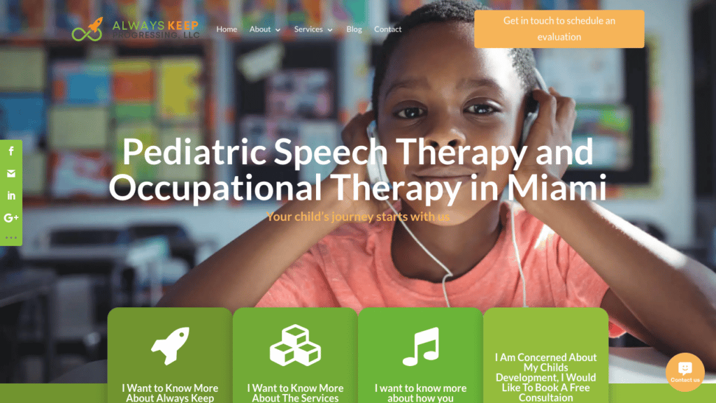
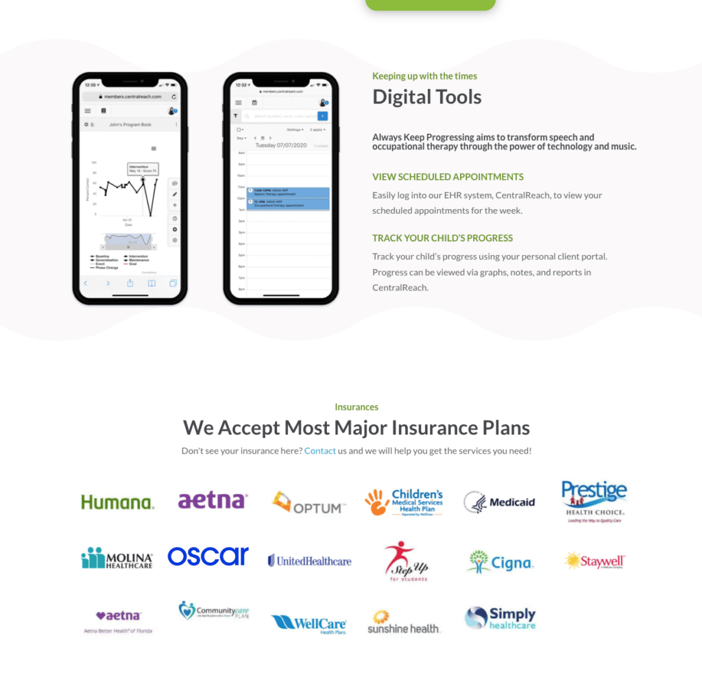
There is a lot that the Always Keep Progressing website does right and it starts off with the Great Hero image that they selected here. They have selected a compelling picture of a young boy; notice that there’s a lot of color and that the boy is looking directly at the website visitor. This is a great hero image choice.
Things this website gets right:
- Visuals: Bright colors, high quality pictures, and graphics that represent the different services offered help make this site engaging and give it an energetic feel.
- Clearly listed benefits:
This occupational therapy website does a great job of clearly articulating the special benefits that they offer to their clients. They have great images showing the ways that parents can track their child’s progress using their app. Additionally, they have a colorful and visually appealing section that clearly lists all the insurances they accept. This is a great thing to include as this is vital information for potential clients, AND a huge selling point for the practice.
- There is a chat option. This is the only therapist website on this list that actually has a chat option. This is great – if you can provide chat services in a way that is HIPPA compliant and where you will consistently and promptly be able to respond to messages you receive through chat.
Things this website could do better:
- Copwriting: There are some places where I think the content on this website could be edited to make it shorter and more effective. For example, the different choices on the hero image, “I want to know more about the Services . . . .” is longer than it needs to be and may lose people.
- Consistent Graphics: They have great graphics but they are missing in some places – if you’re going to have icons to represent some options, you want it to be consistent and have them for all the options.
#8 Wood Psychology
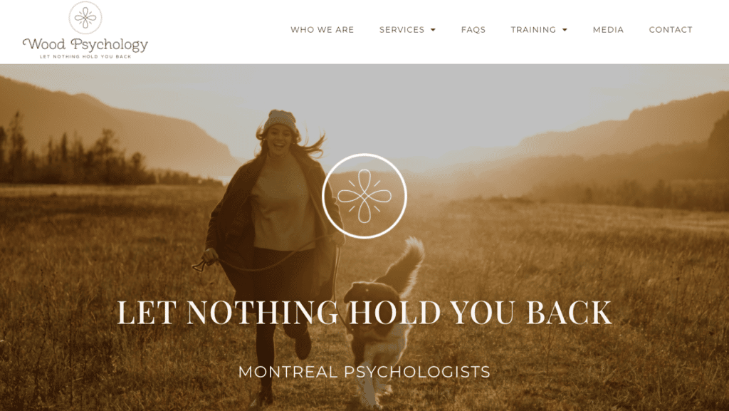
This website was a really enjoyable project and I’m delighted with how the Wood Psychology site turned out!
Things this website gets right:
- Colors: The consistently muted and serene colors used throughout the site really create a sense of peacefulness. The images and videos all compliment and fit in with the feel that the colors are creating.
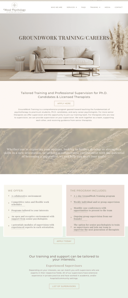
- The Training Program Page: This site is built to speak to both potential clients and potential therapists, and the training page does a great job of effectively communicating with its audience.
- Contact info: Email and phone numbers are available at the top of every page, and several contact buttons are spread throughout the site, giving website visitors plenty of opportunities to get in touch.
#9 Laurie Singer Behavioral Services
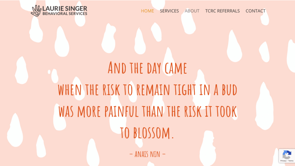
The Laurie Singer Behavioral Health website is really just a breath of fresh air with bright colors, modern design, abstract images, and a lot of very Innovative and eye-catching design elements.The first thing that we noticed when we come to the site is the logo design, which we see both in the favicon and in the upper left-hand side of the website. Below go is very interesting, it’s very unique, and I think that it does a good job of capturing the unique flavor that you got throughout this whole site.
Next we see that they’ve made an interesting decision, and rather than having a mission statement or a tagline right at the top of the site, instead they’ve put a quotation that expresses something important about the approach that they take towards the work they do. They have a lot of bright colors, and a lot of really interesting abstract designs that are woven throughout the entire site really effectively.
Things this website gets right:
- Unique and Memorable Approach:This site is really full of personality and it has an unconventional approach to the design and the images that I think is both effective and also very likely to appeal to exactly the kind of client that this practice wants to attract.
- Video When you scroll down you see that the home page includes a video. This video is a trailer for a book written by the founder of the practice, and having the book trailer here serves to both established the authority of the practice, and to give something very engaging for people to watch when they first come to the website.
What this website could do better:
One part of this site that I feel could be improved is the about page. On the about page you have short bios of different members of the staff but the bios and the pictures are not placed together so it’s actually difficult to tell which picture goes with which name. And overall I think the about section could be laid out in a way that makes it more user-friendly and more compact.
#10 TLC for Grief
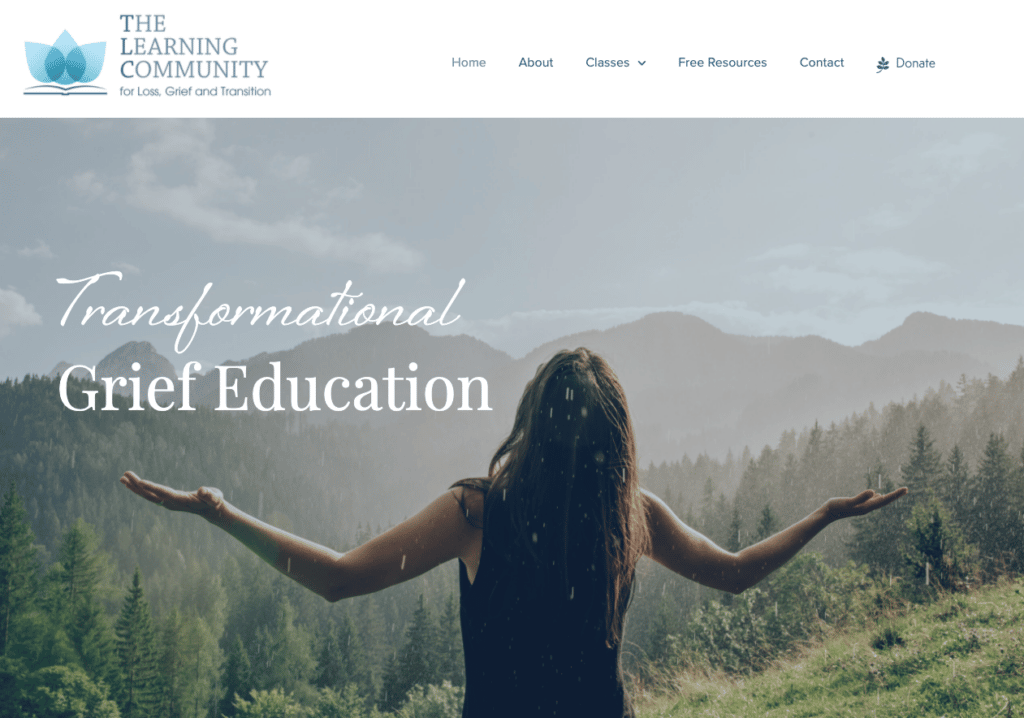
For our last example, we’ll be looking at the website for a non-profit that focuses on an important mental-health topic: helping people cope with grief. The TLC for Grief website does a lot of things right, starting off with the very top of their home page.
Things this website gets right:
- Hero Image: I’ve written before about just how cruical it is to get the hero image right. The hero image is your first chance to tell your visitor that they are in the right place. This image does a great job communicating emotion and grabbing attention from the very first second.
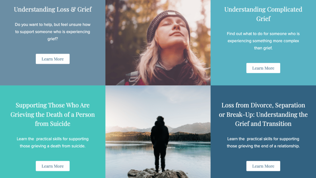
Classes Listing: the way the classes are displayed here is attractive, and does a good job of breaking down the different offerings that TLC has.
- Typography: Typography often is the kind of thing that influences how we perceive a website without us ever noticing. The fonts used on this site are attractive and fit the vibe of the site well. The accent font is not overused, and is both attractive and (even more important!) legible.
Conclusion
I hope you’ve found this exploration list of great examples of therapist websites helpful and inspiring!
If you want to create a successful therapist website schedule a FREE discovery call. You can also sign up for my free video course on the Secrets of a Successful Therapist Website.
Now I’d like to hear from you.
Which of these sites do you think is the strongest?
Do you know of another great therapist website that ought to be on this list?
Leave me a quick comment to let me know!
Did you like this post? Share it!
Podcasts and Guides for Starting Your Private Practice:
- 10 Therapist Podcasts You Should Be Listening to in 2021
- What You Need to Know About Starting a Telehealth Private Practice
- Do I Need An SSL Certificate For My Website – Security for Your Therapist Website
- Custom vs template website: Which One Works Best for Your Therapy Practice?
- New Podcast For Therapists
- Eight Questions to Ask Yourself When Starting a Private Practice in Psychology
- The Impact of Occupational Therapy Slogans on Patient Motivation
- How to Start a Therapy Practice Online: How To Offer It Successfully
- Personal Branding for Therapists : Attracting Your Ideal Clients
- Starting a Private Practice in Counseling! – Therapist Websites
- The Benefits and Drawbacks of a Counseling Website Template: A Comprehensive Guide
- The Best Therapist Websites of 2022!
- Ten Great Therapist Website Examples
- Are Paid or Free Therapist Directories Worth It? A Definitive Guide
Need any of the following?
- Web Design And SEO Services
- Done-For-You Therapist Website Template
- Professional and Customised Web Design
Here are some Sample Websites We’ve Created:
- Exceptional Educational Solutions – Consulting and Advocacy Group
- Group Practice Website Design: Case Study
- Group Practice Website Design for Family First
- Non Profit Organization Website Design
- Online Therapy Websites Example
- Online Therapy Website Design
- Occupational Therapist Website
Check out our Portfolio for more!
Hi! I’m Sarah.
I help counselors and therapists have a bigger impact on the world through better client connection. I do this by creating beautiful visuals and strategically designed websites.

