Professional Website Fonts: Choose the Right Typography for Your Therapy Website|
If you’re in the process of building your very own therapy website, you probably know that there’s more to the task than just the technical aspect of things. In this article, we will look at why you should be choosing professional website fonts and the right typography to help you establish your brand.

While functionality is definitely important in any website, the same amount of importance should also be placed on its overall messaging. As a website offering therapy services, you’ll want to make sure that you present your brand in a way that would encourage prospective clients to trust you.
And what better way to do that than by ensuring that your site’s content—both visual and text, work to underline your professionalism?
Every component of your therapy website should work together to attract the right clients to your services. And that includes the typography on your site.
By ‘typography’, we’re referring to how you arrange the letters and characters you place on your website. That includes considering the height, spacing, line length, point size, and thickness of your text.
So, in this article, let’s discuss…
- Why your typography matters
- The various components of a typeface
- How to identify the best fonts for therapy website
Does Your Typography Really Matter?
No matter what your end goal may be for your therapy website—whether it’s to get clients to sign up on your page or to establish your authority in the field, your website should do one thing: IMPRESS.
A beautiful website with clear and professional branding tells its visitors that the brand it represents is trustworthy and takes pride in its services. So make sure to pay attention to each visual detail you present on your site, even if it may seem trivial. Like your typography for example.
Just think of your favorite brand and check out the fonts that they use for their website. Are their font faces edgy and modern? Are they colorful and fun? What does their typography tell you about their brand?
Different businesses use different typography for a reason. Specific fonts and colors are chosen based on the essence of their branding—how they want others to perceive their business.
So when choosing the font you want for your website, think: What do I want my practice to be known for? What impression do I want to make? What does my private practice stand for?
The typography you choose for your website design should reveal what your answers to those questions are.
But there’s another reason why the type you use is crucial for your website. Whether it’s with the style, size, or spacing of your text, your website needs to be easy to read for the benefit of your visitors.
Think of your target audience for your therapy website. Are they of the elderly population? If so, you would want to use larger fonts and add more spaces between letters and words so they don’t have a hard time reading what’s on your page. Are you trying to attract younger ones to your site? Then you might want to go for smaller and curvy fonts.
Consider your spacing, too. These are the kinds of details that can make your website more accessible, cleaner, and easier to read.
The Components of a Typeface
There are several components of your typeface that you should pay attention to for your website. These are:
- Baseline – This is the line where all of your letters sit.
- Cap Height – This would refer to the distance between your baseline and the tip of your capital letter.
- X-height – This refers to the height of your lowercase letters.
- Bowl – This is the term for the curved part of your characters (as with letters o, b, c, and e)
- Serif – This refers to the winged tips added at the tip of your strokes. Somehow like little feet attached to the characters in your text.
- Defender – This refers to the longest point for letters that end below the baseline (as with letters j, g, p, and q)
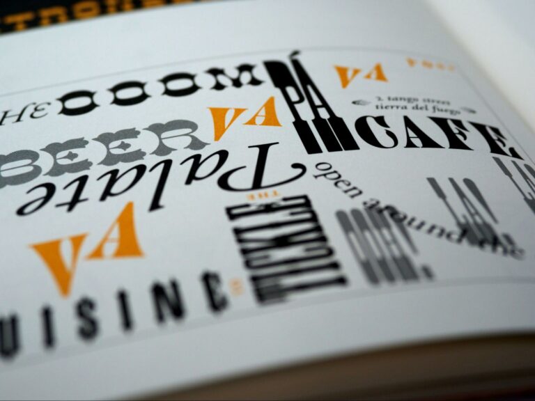
The variations in each of the components mentioned above produce different typesets, such as the ones listed below.
- Serif – As mentioned above, these fonts are characterized by winged tips at the end of the strokes. It’s the font commonly used for printed materials, as the serifs add more spacing between letters, making the text easier to read. Some popular fonts under this category include Georgia, Times New Roman, and Garamond.
- Sans Serif – This is the exact opposite of serif fonts. Sans serif literally means ‘without serif’, and refers to a typeset with clean strokes rather than winged tips. This type of font is widely favored by websites, mainly because it looks modern and easier to read on-screen.
- Blackletter – This is the type of font that you’d usually see in ancient or historic texts, and is characterized by a combination of both thick and thin strokes. While this typeset may look highly creative, it’s also difficult to read, which is why it’s typically used only for documents that need to appear historic.
- Script – This typeset mimics handwritten text. It is casual and more personalized, which is why it’s most often used for wedding invites, for example.
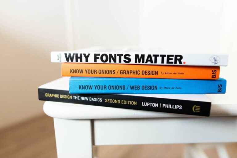
Choosing the Best Fonts for Therapy Website
Yes, there is such a thing as ‘bad typography’. So when choosing your brand fonts, make sure to consider the following:
- Functionality – Think of your audience. Which typeset would make it easier for them to grasp the message you’re trying to get across?
- Screen resolution – Test your font choice on a desktop and mobile device. Is your text easy to read? Again, the goal here is to make sure that your reader doesn’t have a hard time trying to grasp your messaging.
- Brand essence – What impression would you like to create for your brand? Take note, too, that the brand you’ll choose for your website would need to be used for your printed materials as well. If the typeset you choose for your site is not something that you can stick to for all of your brand assets, then it would be best to choose a different set of fonts altogether.
Remember, it only takes your visitors approximately 3 seconds to decide whether your website is worth checking out or not. So choosing the right font type will definitely help in grabbing their attention.
With that being said, here are some of the common font families that websites in the medical field often use. Check them out these best fonts for therapy website and medical businesses:
- Source Sans Pro – This font type is very easy on the eyes and is usually used for lengthy text, such as technical white papers.
- Crimson Pro – It’s of the serif typeface family and is usually used for printed medical communications
- Fjord One – Best used as an accent for your website. It’s a great typeface to use to grab your audience’s attention.
Of course, you can choose more than one typeface for your website. However, you should be careful to pair the right fonts. For example, you may use a Serif typeface for your headings and then use a Sans Serif typeface for the body text. Or, you can pair Script fonts with a Sans Serif typeface as well.
Whatever your pairing choice may be, make sure that it’s still true to your brand essence. Most medical websites take a more formal approach for their branding, but this doesn’t have to be the case for yours. Again, it all boils down to who your target audience is and what typeface would serve them best.
Not sure what to choose and pick out the best font for your therapy website? That’s understandable. There’s a long and almost endless list of fonts to choose from, after all. But it doesn’t have to be complicated!
Book a call with me today and let’s discuss the best typeface options that you have for your therapy website.
Did you like this post? Share it!
Related Reads for Website and Branding Inspirations
- A Unique Website for Family First | Behind the Scenes
- A New Digital Home for The Comfy Place
- The Best Therapist Websites of 2022!
- Ten Great Therapist Website Examples
- Psychologist Website Design Trends 2023
- 6 Things When Creating Video Content For Your Business and Therapist Website
- 12 Future Proof Tips: Website Design For Small Businesses And Therapists
- Web design for Counselors
- Engaging Psychiatrist Website Design
- Copywriting for Therapists Example- Therapist Website Design
- The Best Website Hosts For Small Businesses and Therapists
- How to Create Effective Therapy Website Tagline for Your Practice
- Professional Website Fonts: Choose the Right Typography for Your Therapy Website
- Branding And Therapist Logo – Use Your Therapist Logo Consistently
- Logo Designer – Looking for a Professional Designer
- Therapist Logo Ideas – Find Inspiration in the World Around You!
- Different Logo Types for Therapist Business Branding
- Benefits of a Logo for your Therapist Branding
- Therapist Logo Design – Define Your Brand Identity
- Is It Worth Making a Website for a Small Business?
- Why Doesn’t My Website Show Up on Google Search? Common Issues and Fixes
Need any of the following?
Here are some Sample Websites We’ve Created:
- Website Design For Consulting Business
- Psychotherapist Website Example
- Private School Website Design
- Websites For Counselors
- Counselor’s Website Example
- Website Design For Small Business
- Professional Design
Check out our Portfolio for more!
Hi! I’m Sarah.
I help counselors and therapists have a bigger impact on the world through better client connection. I do this by creating beautiful visuals and strategically designed websites.


