A Brand New Digital Home for The Comfy Place | Behind the Scenes
If you’re looking for a website that would accurately represent your brand and what you believe in, then I’m sure you can relate to Lisa, the owner of The Comfy Place! Awhile back, Lisa asked me to give her website a much-needed revamp. Today, I’m excited to show you how that went!
But first, let me tell you a little bit about her and about The Comfy Place.
How it Started
The Comfy Place was established with the goal of creating a truly comfortable space for each individual – both for children and adults – to make them feel welcome, regardless of what they may be going through. It’s a place where people can come as they are and get whatever kind of help they need so they can heal and enjoy themselves at the same time! And Lisa is the powerhouse that runs the team!
As a therapist, Lisa is extremely passionate about her work and has a big vision for all the ways that she can grow her practice and help more people. She’s committed to doing everything it takes to ensure that her patients realize their fullest potential in life. Her group practice has been growing (fast!) but her website just wasn’t keeping up.
It was time to change all that!
Building the Website
When Lisa and I talked about the project, I immediately knew that her warmth should be part of the ambiance of her website.
Lisa has a joyful, exuberant personality and brings that to all the work that she does. So she wanted her website to have a strong, vibrant presence and an upbeat, welcoming feel. She needed a website that embodied that joyful vibe, and one that conveyed the spirit of how she connects with children and families.
Now as I mentioned, she already had a website, but it just wasn’t working as well as she needed it to. Plus, trying to DIY her website took up way too much time and effort – she was much too busy helping her clients to dedicate huge chunks of time to trying to figure out how to bring her website up to speed.
It was time to upgrade her site, and that’s where I came in!
The first thing we did when creating the site was think about how to reimagine the website with lots of vibrant colors and fun, playful images. Lisa had a professional photographer take high-quality photos of her and the other therapists, and we created a detailed bio page for each therapist – including individualized information about fees and video introductions.
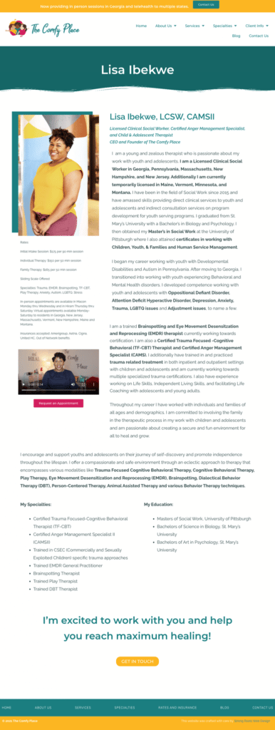
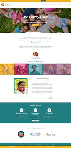
As you can see, the overall goal of the site redesign was to create something that felt playful and fun, while also being engaging and super user friendly. Let me show you a BEFORE and AFTER shot of her website!
So this was her website BEFORE:

And after some weeks of tweaking, here’s what we got AFTER:
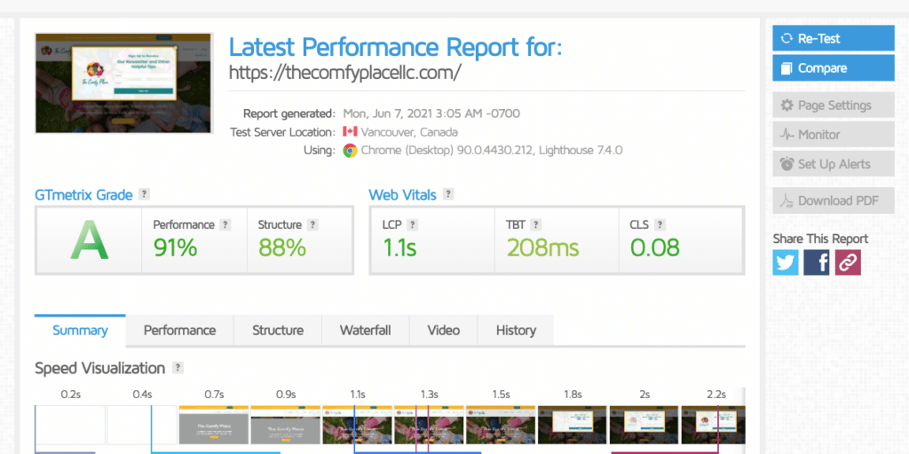
Of course, coming up with an aesthetically pleasing website is important, but so is page speed! We don’t want The Comfy Place’s website to take forever to load, do we? So I did a quick check on their brand new website’s statistics and got these results:
Now The Comfy Place finally has a comfy place online! Yep, pun intended!
What I’ve shown you are just bits and pieces of the whole picture. If you wanna see the full website for yourself, go ahead and check out their new digital home at www.thecomfyplacellc.com!
Want a brand new website too?
You don’t have to DIY everything! You can get a website that would truly showcase your brand and that truly works for your end users without having to stress about codes and all the techie stuff. Yes, you read that right! You can get a beautiful, seamless website while you focus on your zone of genius.
Sounds cool?
If you need someone to help you bring your dream website to life (that’s me!), hop on a complimentary call with me! Just click here to book an appointment.
I’ll see you soon!
Did you like this post? Share it!
Related Reads for Website and Branding Inspirations
- A Unique Website for Family First | Behind the Scenes
- A New Digital Home for The Comfy Place
- The Best Therapist Websites of 2022!
- Ten Great Therapist Website Examples
- Psychologist Website Design Trends 2023
- 6 Things When Creating Video Content For Your Business and Therapist Website
- 12 Future Proof Tips: Website Design For Small Businesses And Therapists
- Web design for Counselors
- Engaging Psychiatrist Website Design
- Copywriting for Therapists Example- Therapist Website Design
- The Best Website Hosts For Small Businesses and Therapists
- How to Create Effective Therapy Website Tagline for Your Practice
- Professional Website Fonts: Choose the Right Typography for Your Therapy Website
- Branding And Therapist Logo – Use Your Therapist Logo Consistently
- Logo Designer – Looking for a Professional Designer
- Therapist Logo Ideas – Find Inspiration in the World Around You!
- Different Logo Types for Therapist Business Branding
- Benefits of a Logo for your Therapist Branding
- Therapist Logo Design – Define Your Brand Identity
- Is It Worth Making a Website for a Small Business?
- Why Doesn’t My Website Show Up on Google Search? Common Issues and Fixes
Need any of the following?
Here are some Sample Websites We’ve Created:
- Website Design For Consulting Business
- Psychotherapist Website Example
- Private School Website Design
- Websites For Counselors
- Counselor’s Website Example
- Website Design For Small Business
- Design
Check out our Portfolio for more!
Hi! I’m Sarah.
I help counselors and therapists have a bigger impact on the world through better client connection. I do this by creating beautiful visuals and strategically designed websites.


