12 Things You Should Know Before
Starting a Counseling Website (And a FREE Bonus!)
Your counseling website isn’t meant to simply be a visually attractive brochure about the services that you offer. Websites for counselors should also be tools that can be used to actually help you connect with more people and get more clients.
However, there are several mistakes that can cause even an attractive website to simply not bring new clients into your practice. Today I’m going to go over the 12 things that absolutely need to know before you start your counseling website! Once you are finished reading this post you will be ready to have a website that actually helps you to connect with more therapy clients. (Plus, there’s a free bonus at the end!)

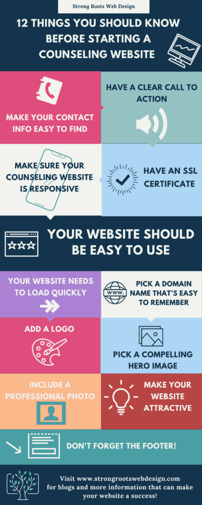
#1 Make Your Contact Info Easy to Find!
This one might seem obvious, but I can’t tell you the number of counselors websites that I have seen that make this simple mistake. It is crucial that one of the first things that people see when they visit your website is information about how to get in touch with you. This can mean your phone number, your email address, or a call to action button, that says “Contact Me.”
The best approach of all is to have all of these options available! Remember that some people are going to be most comfortable picking up the phone, while others are going to be more comfortable reaching out through email or via a contact form on your website. However you decide to do it, the most important thing is that you make it very clear and easy for people to see how to get in touch. If you list your phone number, make it clickable, so that people can dial directly to you without having to write your phone number down.
This is something simple and quick that will have a real impact and make it more likely that the people who visit your website will actually get in touch with you.
Starting A Counseling Website
#2 Have a Clear Call to Action!
One of the keys to making your counseling website easy for potential clients to use is making it very clear what action you want website visitors to take next. This means that you shouldn’t be competing with yourself by asking people to do more than one thing. So, for example, if you want people to contact you after visiting your website then most of the buttons on your website should be encouraging people to contact you. On the other hand, if you are most interested in getting people to sign up for your newsletter, so that you can build a relationship with them over time and convert them into a client sometime down the road, then throughout the website you should be consistently inviting them and reminding them to sign up for your newsletter.
If you want people to contact you, but have a secondary option such as signing up for a newsletter that’s also fine, but you need to make it clear that the primary focus of what you want people to do is contacting you. And you want to make the steps for how to do that very simple and straightforward.

Remember that people are often multitasking while they’re on your site. That means that they may be about to run out the door to pick up their kids from school, while dealing with emails from work, and making a hundred other decisions while dealing with all of the complexities of their day. You want to make being on your website the simplest thing about their day. That means making it very clear what steps they should take next, and what they need to do in order to take those steps.
#3 Make Sure Your Counseling Website Is Responsive
Did you know that studies show that approximately 60% of people right now or accessing websites primarily through their smartphones? And that number is only going to go up. That means that one of the most important things about your website is that it is responsive. Having a responsive website means that the website is designed in a way where it will automatically resize its content so that, no matter what device a person is using to access your site, your website will always be easy to read and to use.
Having a responsive counseling website is also now one of the ways that Google evaluates the quality of your website. Since Google knows that most people are using their phones to look at websites, if they see that your website is hard to use on a phone or iPad, then they will rate your site as being low quality, and are less likely to show it to potential clients.

#4 Websites For Counselors Need to Be Secure
It used to be that only websites that were going to accept credit card information needed to have an SSL certificate. However, things have changed. Nowadays, any website that wants to assure the privacy of its visitors, must have an SSL certificate. In fact, Google has also started using the presence of an SSL certificate as one of the criteria for evaluating the quality of a website. This means that having an SSL certificate will not only make your website visitors feel safer, but it will also make sure that more people actually see your website come up in search results.
(You can read more in depth about SSL certificates for counselors websites in my blog post here.)
#5 Therapist Website Design Should Be Easy to Use

Having a counseling website that is easy to navigate and has an intuitive layout is very important for all therapists websites. This is because you want to create a feeling of safety and trust with the potential clients who are coming to your website. For this reason, when you’re making design decisions for your website, you should make sure that your website is easy to use and that website visitors will have an easy time finding whatever information is most relevant to them.
#6 Your Website Needs to Load Quickly
Slow loading speed can be a real problem for many websites. It can be caused by many things, such as images that aren’t properly compressed, poor website hosting, or lack of updates. But whatever the reason, the statistics are very clear: a website that takes more than a few seconds to load will lose most of its visitors. This means that a person will navigate to your website, and then click away if your website doesn’t load almost immediately.
Not sure if your website is loading quickly enough? Google will let you check your website load time for free! Go here and enter your website address. Google will let you know how quickly your website loads, and even give you suggestions on how to improve your loading time.
#7 Pick a Domain Name That’s Easy to Remember
When you’re picking a domain name for your private practice, one of the things that you should keep in mind is that you will want people to have an easy time remembering the name of your practice, and also your domain name. Avoid making your domain name name something which is either difficult to remember, or very hard to spell. Remember that simple is best, and that the main goal when picking your domain name is to make it very easy for people to find you.

#8 A Logo (Even a Simple One) Makes Your Counseling Website Look More Professional
Making decisions about logos can feel overwhelming, but this is one area where it’s important to not let the perfect be the enemy of the good. Even a simple typographic logo can help make your counseling website look more polished and professional.
#9 Pick a Compelling Hero Image

The hero image is the first large image that is visible above-the-fold when people first land on your website. And in many ways, it is your first chance to make a strong and positive first impression. For this reason it’s very important that the hero image that you picked is engaging, and conveys the overall tone that you want your website to have.
Images that are uplifting, positive, and hopeful over images that convey a sense of sadness or negativity. Even if the people who are coming to your website or currently struggling, your website is all about helping them move past those problems to a more positive place. For that reason you want your website to have an overall feeling of hopefulness. Plus, having dark or depressing images on your website, is likely to cause your website visitor to feel hopeless and make it less likely that they will take action and actually reach out to you about becoming your client.
#10 A Professional Photo of You is a Must
This one can be hard for some people, but you really must have a professional photo of yourself on your website.
When people come to your website they’re trying to get a sense of who you are and whether or not they feel comfortable becoming your client. It is absolutely crucial that they actually get to see your face. There’s no substitute for this, and even though some people feel shy or otherwise uncomfortable with putting their picture on their website, remember that you are asking people to come into your office and talk to you about things that are very very difficult for them. In the same way, you have to be willing to show up for them on your website, and give them a real feeling for who you are and how you could be a positive source of change in their lives.
#11 Use Colors and Typography to Make Your Site Visually Appealing
Don’t underestimate the power of the right combination of colors and typography to make a website feel engaging and friendly. Remember, that just as when you talk to someone face to face a lot of the information that is conveyed is nonverbal through body language: on a website the design elements take the place of body language. That means that the look The Colors the fonts and images that go on to your site are what create the subconscious messages about what your site is about and what you as a counselor are about. So make sure that you’re making choices about those design elements carefully and with a lot of thought.

#12 Don’t Forget Your Footer
The footer is the last thing that people see on your website. It’s easy to forget, often overlooked, and actually a very powerful tool that you can use to engage with your website visitors. When someone is scrolling through your website, if they get all the way down to your footer that means that, for whatever reason, they haven’t clicked on any of the previous material. Now your footer is your last chance to engage them. For this reason, your footer should be well designed, and include both contact information, and an invitation to sign up for your newsletter. If a person has gotten all the way to the bottom of your site that means that
- A) You have held their attention and they haven’t clicked away. (Good Job!) And . .
- B) They’re not quite ready to get in touch with you yet.
Having them sign up for your newsletter gives them a way to stay in touch and get to know you over time making it more likely that they will in fact get in touch with you when the time is right.

Now It’s Up To You
I hope this article has given you some concrete, actionable ideas for your counseling website!
Now I want to know what you think. What questions do you have about what you’ve read?
Leave a quick comment below and let me know!
Did you like this post? Share it!
Related Reads for Your Therapy Website
- 12 Things You Should Know Before Starting a Counseling Website
- The Top Ten Therapist Website Examples
- 5 Common Mistakes to Stop Making on Your Therapist Website Immediately
- Therapist Websites: 8 Myths Every Therapist Should Know!
- ADA Compliant Therapist Website Design: Enhance Accessibility!
- Advanced Features for Psychiatry Practice Websites
- Best Ecommerce Solutions for Small Business and Therapy Practice Websites
- Best Practices for Psychologist Web Design
- Attract More Clients! Building a Therapist Website That Works
- Therapist and Couples Counselor Website Design Solutions
- Tips from a Therapist Website Builder
- Creating customized websites for Child Therapists
- Finding Joy in Your Practice: 4 Things to Learn from Donald Altman
- Why Help with Website Design Can Help Your Private Practice
- The Best Website Hosts For Small Businesses and Therapists
- Privacy-Compliant Therapist Website Design at Your Fingertips
- Psychologist Website Design Trends 2023
- Top 10 Reasons to Have a Website for Your Business Today
- Web Design Ideas for Mental Health Awareness Month
- Web Design for Therapists and Healers
- The Importance of Regular Website Design and Maintenance Services for Small Businesses
- 12 Future Proof Tips: Website Design For Small Businesses And Therapists
Need any of the following?
- Web Design And SEO Services
- Done-For-You Therapist Website Template
- Professional and Customised Web Design
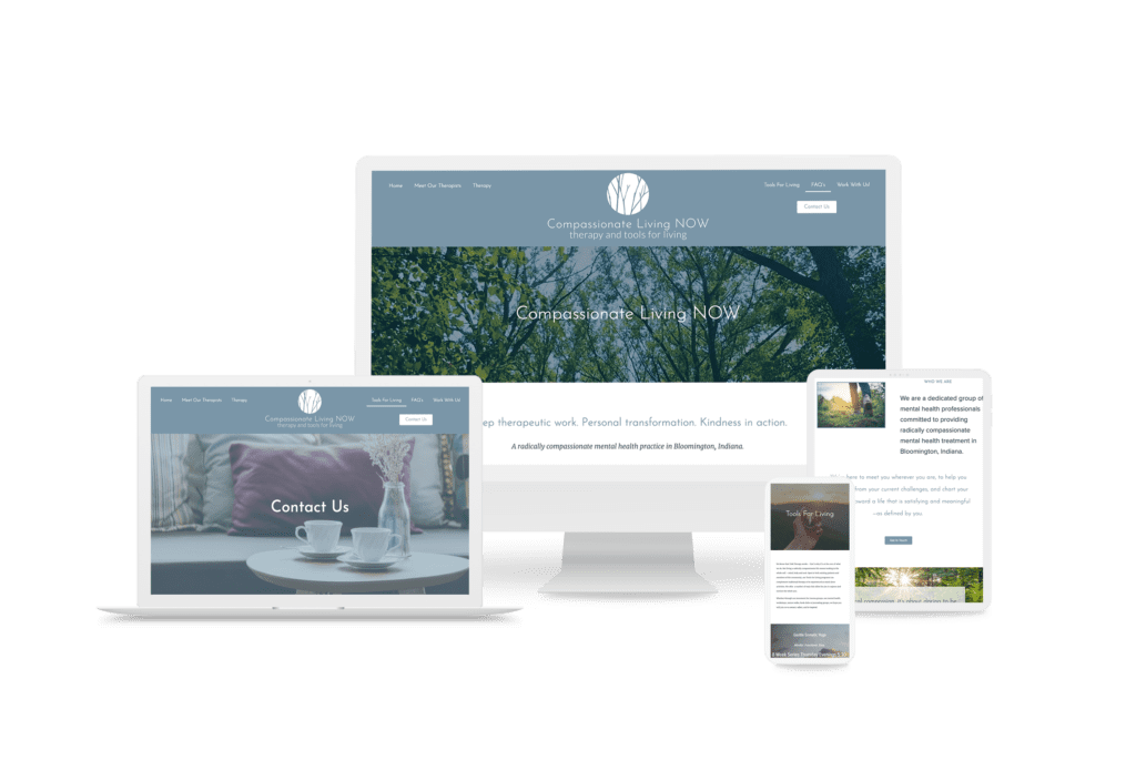
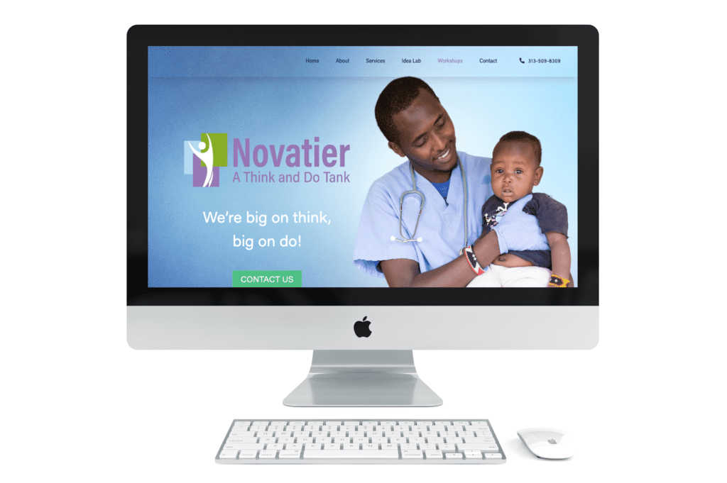
Here are some Sample Websites We’ve Created:
Hi! I’m Sarah.
I help counselors and therapists have a bigger impact on the world through better client connection. I do this by creating beautiful visuals and strategically designed websites.


4 thoughts on “12 Things You Should Know Before Starting a Counseling Website (And a FREE Bonus!)”
Do you mind if I quote a couple of your posts as long as I provide credit and sources back to your blog? My blog is in the same niche as yours, and my users would benefit from some of the information you provide here. Please let me know if this ok with you. Thank you.
Thanks for checking – that’s fine with me!