5 Common Mistakes in Therapist Website

In this post, we’re going to talk about the five mistakes that I see all the time on therapist websites and how, by avoiding them, you can make your website a much more effective tool for connecting with potential clients. These are super common errors and they’re things that can really undercut the effectiveness of your site.
By the end of this, you should be able to know if you’re making these same mistakes and how you can fix them.
#1 Social Media Icons
While social media is a powerful tool (and it’s something that we definitely want to encourage people to be involved in, especially if you’re trying to encourage people to know about and go to your private practice.)
But the time for social media is not when people get to your website! This is because your website is your best opportunity to talk to people without all of the distractions.
We put a TON of work into creating your website and getting people to visit it so that they can learn about why working with you would be so special. And the LAST thing that we want to happen is for them to finally get to your website . . . and then see those bright colorful buttons that are inviting them to go to Facebook or Instagram, essentially inviting them to leave your website.
I’ve been on social media enough time to know that if they click on these buttons, they end up in the world where there are 10,000 distractions.
Whether it’s casserole recipes, cat videos, or a political argument with a relative – social media is essentially the definition of distraction – and this is why we don’t want to prominently display social media icons at the top of your website.
If you still want to have social media icons somewhere on your therapist website, you can put them in the footer of your website or on your contact page. We just don’t want to make them a super prominent thing that you see right when you get to the site.
#2 Sad Images

Another thing that I would say is a major mistake are pictures of sad people.
Now, this is a really understandable mistake because when you’re a therapist you work with people who come to you with their problems, so it makes sense that when you’re thinking ‘How am I going to show people that I understand where they’re at, that I understand their struggle – I’ll put a picture of a person crying on my website’ but even though the logic makes sense, it’s a big mistake for a couple of reasons.
Let’s think about it in terms of a dentist website. When you go to a website for a dentist, do you see pictures of horrible cavities and people who obviously are in a lot of pain? No. You see people smiling with their bright white teeth, people who are happy because now their teeth are well cared for.
This is a basic principle — when we’re talking to people, what do you want to talk to them about? The end result.
We want to talk to them about where you can help them get to. We don’t want to emphasize and talk about what they’re currently experiencing (at least not through pictures. We’ll talk about the content on your website in a future post.)
Think about it this way: if a person is having a hard time and thinking about coming to a therapist and then they go to a website and they see these really heart-rending and depressing photos, it’s really discouraging and upsetting to look at.
We want people to come to your website and feel hope, because we’re trying to get them to take action and decide to actually contact you. If you show them a lot of images that are really disheartening and discouraging and make them feel worse, then they don’t have any hope. They won’t have any energy to actually take what is actually a fairly big step and reach out to someone that they don’t know and say “Hey, here’s all the stuff that’s really hard for me. Let’s talk about it.”
So you really really don’t want to make that mistake. You want to show hopeful and encouraging photos.
#3 Fake and Cringy Photos

The third mistake is having really cringy and fake looking photos on your website. You’ll want to have authentic looking high quality photos and a lot of times those photos are going to be people who aren’t looking directly at the screen, who don’t look like they’re posing for instagram.
You want photos that are uplifting and yet real. These photos won’t look like your standard, run-of-the-mill, really low quality stock image photos.
#4 Not Optimized for Mobile Devices

Another one of the big mistakes that a lot of therapist websites make is that they’re not optimized for mobile devices.
What does this mean?
Nowadays, websites have to be designed so that no matter what screen size someone is using, they automatically change size and all of the information on the website automatically resizes so it fits any size screen or device. If your website doesn’t do this, that means that it looks fine on a desktop but when accessing it on your phone or on your tablet, the images are too big or the text is too small and you have to scroll around trying to find information. It’s extremely difficult to use and most of the time if your website is not optimized well and someone tries to access it on their mobile device, they’re just going to leave and won’t bother to even try to figure out how to use it. They’ll leave your site and go to the next website that came up in their google search results.
Nowadays, upwards of 60% of people are accessing websites through their mobile devices so even if you think your website looks lovely on your desktop computer, if it doesn’t work on mobile devices, you are losing at least if not more than 60% of the people who come to your website right off the bat.
This mistake is easy to avoid, you just want to make sure that your website is optimized for mobile.
#5 Not Having a SSL Certificate
A SSL Certificate is something that you install on your website that helps the internet know that the information that’s sent through your website is going to where it’s supposed to go.
Usually, you can tell whether or not a website has an SSL Certificate just by looking in the search bar next to the url. It’ll have a little picture of a padlock that shows that it’s secure.
This is something very, very, basic but if you don’t have it, it can be a huge dealbreaker.
Nowadays, if a website doesn’t have an ssl certificate and when a person clicks to go there, they’ll get a big warning that says “This website is not trustworthy and the people at this website might be trying to steal your information. Are you sure you want to go here?”
Think about what we try to do on a therapist website. We try to build trust and build a feeling of connection, so that people can be vulnerable and reach out to you and ask for help when they need it. So coming up to a warning that says the people on this website might be trying to steal your information is exactly the opposite of the experience that we’re trying to convey and I can guarantee you that if people are getting that warning when they’re first coming to your website, they’re not going to continue to your website at all anymore. They will leave to find a more trustworthy site.
Surprisingly, this mistake is not uncommon at all because it’s a technical thing that you have to know but it’s an easy fix and it’s something you can do. It’s something that will make sure that people actually come to your website safely and are able to access the content on it without worrying that something wrong is happening.

Have you made any of these mistakes on your website or are there other mistakes that you’ve seen on therapist websites that you think should be included in the list?
Did you like this post? Share it!
Related Reads for Your Therapy Website
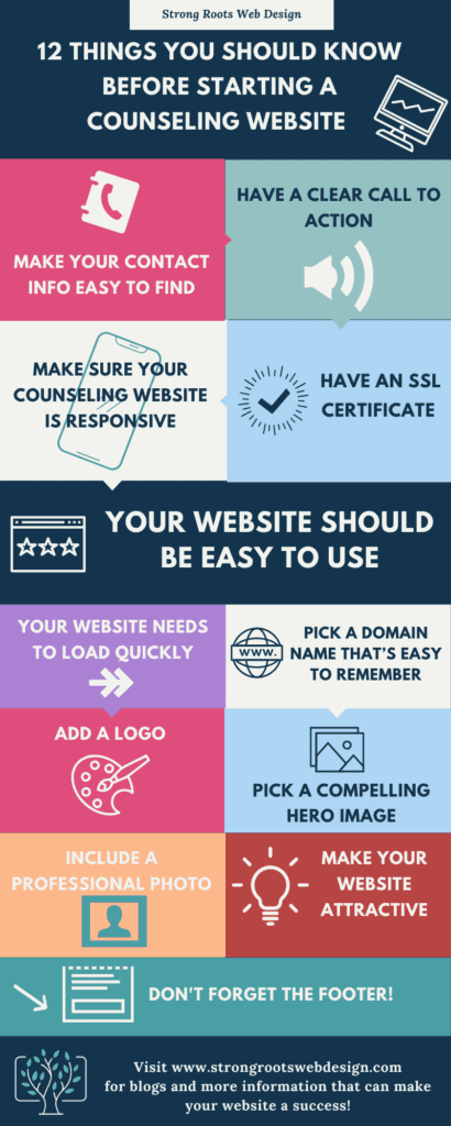
- 12 Things You Should Know Before Starting a Counseling Website
- The Top Ten Therapist Website Examples
- 5 Common Mistakes to Stop Making on Your Therapist Website Immediately
- Therapist Websites: 8 Myths Every Therapist Should Know!
- ADA Compliant Therapist Website Design: Enhance Accessibility!
- Advanced Features for Psychiatry Practice Websites
- Best Ecommerce Solutions for Small Business and Therapy Practice Websites
- Best Practices for Psychologist Web Design
- Attract More Clients! Building a Therapist Website That Works
- Therapist and Couples Counselor Website Design Solutions
- Tips from a Therapist Website Builder
- Creating customized websites for Child Therapists
- Finding Joy in Your Practice: 4 Things to Learn from Donald Altman
- Why Help with Website Design Can Help Your Private Practice
- The Best Website Hosts For Small Businesses and Therapists
- Privacy-Compliant Therapist Website Design at Your Fingertips
- Psychologist Website Design Trends 2023
- Top 10 Reasons to Have a Website for Your Business Today
- Web Design Ideas for Mental Health Awareness Month
- Web Design for Therapists and Healers
- The Importance of Regular Website Design and Maintenance Services for Small Businesses
- 12 Future Proof Tips: Website Design For Small Businesses And Therapists
Need any of the following?
- Web Design And SEO Services
- Done-For-You Therapist Website Template
- Professional and Customised Web Design
Here are some Sample Websites We’ve Created:
Hi! I’m Sarah.
I help counselors and therapists have a bigger impact on the world through better client connection. I do this by creating beautiful visuals and strategically designed websites.


