Functionality, aesthetics, and psychology are the cornerstones of a robust digital identity, essential for creating online platforms that resonate and thrive.
Mental health websites, in particular, are central to this conversation, where compassionate design should not be neglected.
When first introduced to the concept of color psychology, I keenly observed the colors around me, attempting to correlate the psychology theory with my feelings.
During this process, I came across the power of colors for mental health. It doesn’t open a door to a hidden realm. Instead, it turns our attention to a prevalent yet overlooked factor of our daily digital experiences.
Blue, for instance, has always moved me. Its significance spans various platforms: communicates trust on social media, projects calm within homes, forms the base of numerous global corporate identities, and stands as a color symbolizing tranquility and mental health on many online platforms.
In this article, I’ll discuss one vital part of this design equation: using colours for mental health. This intriguing topic touches on many elements, from psychological influence to social responsibility, underscoring its significance.

The Power of Colour
Different colors convey different emotions, a fact that’s been harnessed across various industries, from marketing to education. For mental health websites, it’s crucial to be careful with the colors you choose.
When choosing colors for mental health, potential implications should definitely be considered. Green is often associated with nature and tranquility but is also used frequently in hospitals due to its perceived calming effects. It implies growth, renewal, and life, providing a calming influence that helps reduce anxiety.
Yellow, often related to happiness and positivity, can lead to frustration or agitation when overused or placed with contrasting colors, proving how a color’s effect can be enhanced or diminished depending on its use.
How Can Colors Affect Mental Health
Excitingly, research in color psychology is continually expanding, giving further insight into the interplay between colors and human emotions. Much attention has been given to how colors can be used positively, capturing attention and influencing moods.
Yet, it’s paramount to remember the ethical implications of such power. Mental health websites can use colors to create a positive environment and sway emotional responses, but they should always be mindful of the influence they wield and use it responsibly.
Colors and Accessibility
Colors for mental health must also be chosen with accessibility in mind. Widely overlooked, color contrasts are of utmost importance for the visually impaired, while color choice can be significant for those with color blindness.
Colors can dramatically help or hinder the user experience, even for neurotypical people. As a common example, blue text on a dark background can cause strain and drive users away.
There’s no one-size-fits-all approach to this. Each mental health website should consider its specific audience and its possible needs. Color considerations should go beyond design and consider potential navigational difficulties due to inappropriate color choices.
The Role of Color in Everyday Life
Throughout my career, I have noticed that color does not exist in a vacuum. Its implications are as dynamic as the settings in which it is found.
Certain tones can enhance learning efficiency and focus on educational environments, whereas, in marketing, colors can influence brand perception and consumer behavior.
Imagine entering a store. The vibrant reds and oranges encourage a sense of urgency or alertness, whereas softer blues and purples evoke luxury and calm, subtly shaping your shopping experience.
Different Colors and How They Can Affect Your Websites
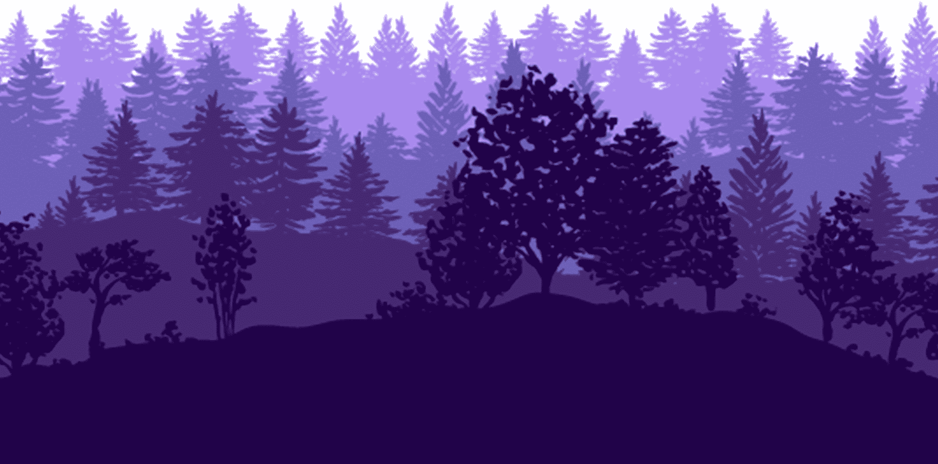
The Tranquil Blues and Balanced Greens
When I think about colors for mental health, blue is often the first to come to mind.
Esteemed for its calming effects, blue is recognized by various studies, such as those by the Pantone Color Institute, as a color that can help lower heart rate and reduce anxiety. It makes it a natural choice for mental health websites, where visitors seek solace and peace.
On the other hand, Green draws its restorative powers from its association with nature. It sits at the center of the color spectrum, prompting balance and harmony.
The Journal of Environmental Psychology links exposure to green, even in imagery, with stress reduction, suggesting that using green in web design can replicate these effects.
The Warm Embrace of Earth Tones
Earth tones bring a welcoming warmth to digital spaces.
Colors like terracotta, beige, and olive, often associated with stability and reliability, can help create a secure environment that encourages openness and trust.
These colors add a layer of humanity and grounding that serves as a soft backdrop to the empowering journey users may be on.
Different organizations recognize the importance of comforting environments for mental health treatment. While their guidelines refer to physical spaces, the principles are just as applicable to websites.
The warmth of earth tones aligns seamlessly with recommendations for environments that respect dignity and promote a positive therapeutic experience.
The Vibrant Energy of Yellows and Oranges
Yet, there’s room for liveliness in this symphony of colors. Carefully introduced, shades of yellow and orange can offer a cheerful vibrancy that sparks optimism.
Nonetheless, as per the Color Research & Application Journal findings, moderation is key, as these excess colors can lead to agitation rather than inspiration.
These colors’ illumination must be handled like a gentle glow rather than a glaring beacon, offering hope but not overwhelming visitors with intensity.
I tread lightly with these hues, inserting them as accents that draw attention to key resources and positive affirmations.
The Sophisticated Subtlety of Pastels
Integrating pastel shades is another chapter in the narrative of colors for mental health.
The soft, washed-out tones have a unifying effect, tying together the digital palette with an understated grace that doesn’t demand attention but gently holds the user’s focus.
Research by the Colour Association of the United States suggests pastels can aid concentration and calm, a valuable trait when constructing navigation paths within the website that are intended to be seamless and stress-free.
Technical Application of Different Colors in Mental Health Websites
Accessibility and Inclusivity in Color Selection
The technical side of color implementation cannot be ignored; accessibility and inclusivity are pillars of responsible design.
Ensuring that colors are pleasing and functional for all users, including those with visual impairments or color vision deficiencies, is paramount.
The Web Content Accessibility Guidelines (WCAG) offer a gold standard, providing color contrast and brightness specifications to accommodate a full spectrum of users.

Testing and Feedback: A Cycle of Improvement
Theories and guidelines shape the blueprint, yet the accurate gauge of success lies in real-world application.
By engaging with user testing sessions and gathering feedback, I have refined my approaches to color usage.
Such an iterative process, grounded in human experience, propels the forward motion of my design philosophy.
The Continuum of Learning and Adapting
Even after a mental health website goes live, the journey of colors for mental health continues.
Like the science of psychology, understanding how colors affect us and can be leveraged for healing is an evolving field.
Continuing education through resources ensures my designs remain at the forefront of innovation and empathy.
A Balance of Color
No single color was the silver bullet. The best approach is a balanced and deliberate combination of colors, each serving a specific purpose.
Blue laid the groundwork, establishing a base of trust and calm.
Green offered connections to the natural world, symbolizing growth and renewal.
Muted warmer tones provided emotional warmth and welcome—this palette, carefully woven together, aimed to envelop users in a supportive and understanding space.

The Importance of Research and Personalization
As we continue to study the science of color psychology, we must personalize our approaches to honor individual experiences and preferences.
What resonates for one may not hold the same for another.
Therefore, research combined with personalization is key to harnessing the psychological power of color effectively.
Final Thoughts
As I muse about my journey through color psychology and its impact on digital mental health platforms, I point out that it is essential to understand this field is continually evolving.
Harnessing the power of colors for mental health websites goes beyond simply choosing a soothing color palette. It involves a keen understanding of the psychological effects of colors, a thoughtful approach to design, and a dedication to making digital spaces more accessible and inclusive.
It’s a great challenge but a stimulating one that can improve functionality, user experience, and the overall impact on mental health.
Whether it’s the calming influence of blues and greens or the uplifting energy of yellows and oranges, each color choice is an opportunity to guide and support users on their journey toward wellness.
If you want to create an online space that harnesses the healing power of colors, let’s connect and bring your vision to life.
Schedule a 30-minute call with me, and let’s discuss your project, objectives, and how the psychology of color can enhance your mental health website.
You can also browse my portfolio to witness firsthand how I’ve incorporated the power of colors into my recent website designs.
Let me help you create an online presence that resonates with your audience and significantly contributes to their healing process.