
You built the website. Maybe you built it yourself over a few weekends, maybe you paid someone, maybe a friend who’s good with computers put it together for you. It’s up. It looks fine. It has your photo and your credentials and a page about your approach.
And nothing happens.
Weeks go by and the phone doesn’t ring. You check your email and there’s nothing. You start to wonder whether the whole thing was a waste of money, and honestly, that’s a completely reasonable thing to wonder.
So let’s talk about why this happens. And I want to do it using a real website, because this is so much easier to see in a specific example than it is in the abstract. Lauren is a therapist who let me review her site publicly, and I’m grateful to her for it, because almost every single thing I found on her website I have found on dozens of others.
The short answer
Most therapist websites that don’t bring new people in are failing at one of two things: either people can’t find the site at all, or people find it and can’t tell within a few seconds whether you’re the right person to help them.
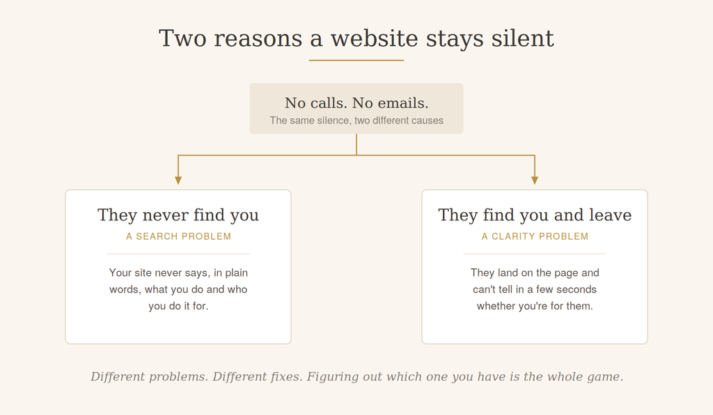
Those are two completely different problems with two completely different fixes, and figuring out which one you have is the whole game. A beautiful website nobody finds and a findable website that doesn’t connect both produce exactly the same silence.
This article is mostly about the second one, because it’s the one almost nobody diagnoses correctly.
It’s not that your website is bad. It’s that it’s written for your colleagues.
I want to say this clearly, because there’s usually a lot of shame in the room when I talk to therapists about this.
It’s not that your website is bad. It’s that it’s built for the wrong reader.
Most therapists build their websites for their colleagues and not for their clients. And there are two very good reasons for that. The first is that your colleagues are the ones actually looking at your website and giving you feedback on it — your clients aren’t going to email you and say “I almost didn’t reach out because I couldn’t tell what you did.” The second is that you went to school for a long time, and talking about your work in professional language is now the most natural thing in the world to you. Of course it is. That’s what expertise does.
So you write something you could hand to another clinician, and they’d read it and say, yes, that makes sense, that’s who you are.
But that is not the document a frightened stranger needs.
You have about four to six seconds
When someone lands on your site, they’ll spend roughly four to six seconds at the top of the page before making an instinctive decision about whether to stay or leave. They’re not going to think it through. They’re not going to ask themselves why they’re staying or going. They just react to what’s in front of them, and then they either keep reading or they close the tab.

That’s not fair. But it’s the reality, so we want to take full advantage of that first screen.
Which means every single decision about that top section matters more than any other decision on the entire site.
Your website is a mirror, not a portrait
Here’s the shift that changes everything.
Your website is not about you. It’s about the person reading it. Even your About page is about them.
On Lauren’s homepage there’s a really lovely professional headshot right at the top. It’s warm, it’s approachable, it genuinely makes you feel like this is someone you could talk to. I’m glad she has it, and it absolutely belongs on her website.
I just wouldn’t put it there.
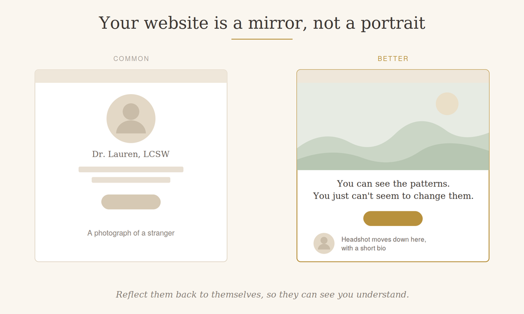
in, with the headshot moved further down the page.
Because when your website loads, we want to reflect your client back to themselves, so they can see that you understand them and that you’re there for them. That first image is the one chance to make someone feel I belong here — and a photograph of the clinician, however lovely, is a photograph of a stranger.
So the headshot moves down the page, where it does great work alongside a short bio and people can start to feel like they know you. And the top of the page gets an image that resonates with the client instead. That might be a high-quality image that represents the kind of person you work with, or the kind of struggle they’re in. It might be a nature scene. It doesn’t have to be literal. It just has to create a feeling that makes the right person think, oh, this is for me.
Peer-to-peer language creates distance
This is the single most common problem I see, and Lauren’s site shows it beautifully because her writing is genuinely good — the words are well chosen, the tagline is strong. “You can see the patterns. You just can’t seem to change them,” with the emphasis on stuck. That’s going to resonate with a lot of people, and it’s exactly right.
Then just underneath, the site says: transformative and neuroaffirming relational therapy.
Two of those three words are doing excellent work. Transformative is proactive and empowering — it feels like taking action, which is a great thing to create at the top of a page. Neuroaffirming is fantastic, because it’s a real niche. It tells a very specific group of people that you have the expertise they’re searching for, and it tells everyone something true about how you approach the work.
But relational therapy is peer-to-peer language. If you were talking to another therapist, you’d say “I do relational therapy” and they’d know exactly what you meant. To a person who has never been to therapy before, it means nothing — and worse than nothing, because unfamiliar clinical language creates distance and a little bit of discomfort right at the moment we’re trying to build a bridge.
The same thing happens further down, where the site talks about healing trauma and CPTSD.
Here’s the problem with that, and it’s subtle. Most people don’t know they have trauma. That’s something they discover after they’ve been working with you for a while. So when someone in real distress reads “I help people heal trauma,” a very common reaction is: well, that’s not me. I don’t have trauma. Maybe all my relationships end badly and maybe I keep repeating the same patterns, but that’s not trauma.
And CPTSD — a lot of people don’t know what it stands for, and the ones who do mostly don’t know they have it.
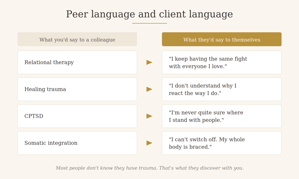
So we lose them. Not because anything on the page is wrong, but because the page is describing a destination they haven’t arrived at yet.
What to write instead
Describe the symptoms in the words the person would use before they had a diagnosis. Feeling anxious about every relationship. Never being sure where you stand with people. Needing to check and re-check. Not sleeping. Fighting with your spouse every night.
And then — this is the part I really like — put a second column right next to it. On the left, the struggles: you may be experiencing this. On the right, here’s how I might help. A short list of the approaches you’d take, the therapies you’d explore, the things you’d actually do together.
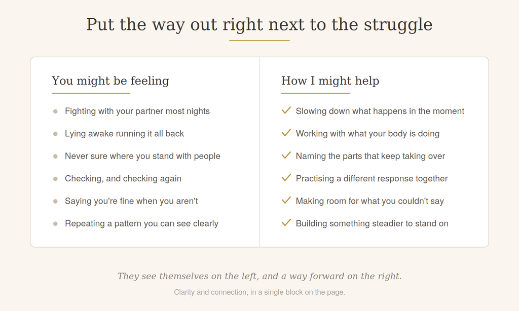
Now the person sees themselves in the first column, and sees a way out in the second one. That’s clarity and connection in a single block on the page.
Buried treasure
This one is my favorite, and it’s the reason I get a little indignant about all of this.
I spent about twenty minutes on Lauren’s website. Twenty minutes. And near the very bottom of a services page, I found that she runs a Neuro Spicy Motherhood group for ADHD moms.
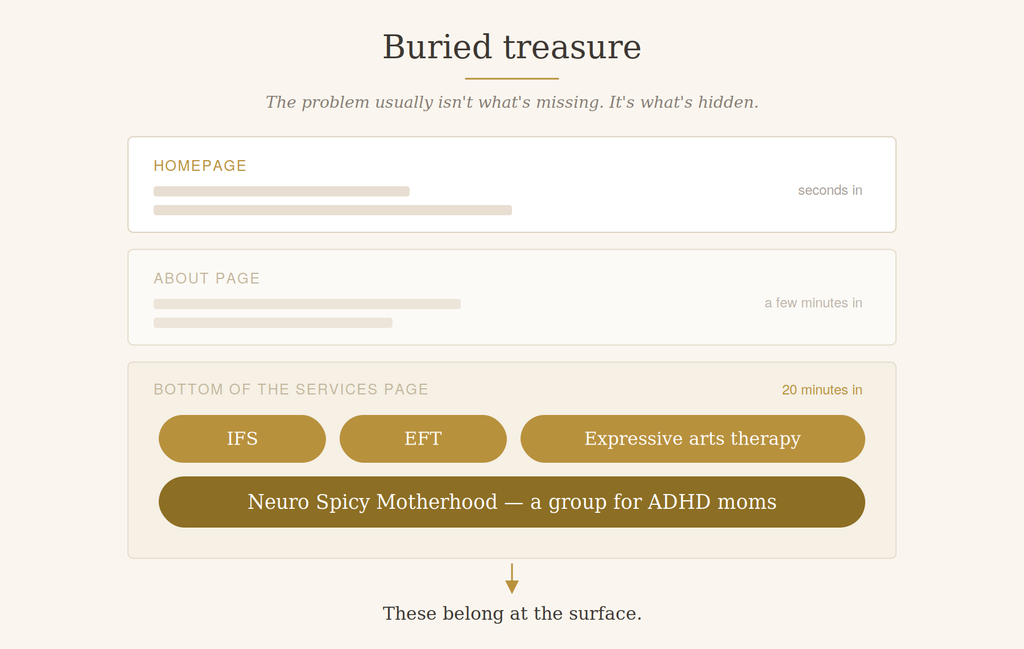
That is such a good idea. It’s specific, it’s warm, it’s exactly the kind of thing that a particular group of people are desperate to find, and it exists nowhere else on the site. No page. No mention on the homepage. Nothing in the menu.
And that wasn’t the only one. Deep in her About page, past a lot of professional framing, I found that her practice is holistic, integrative and embodied, that she combines an attachment-based framework with somatic practices and expressive arts therapy, that she does IFS, that she does EFT, and that she has advanced training in all of it.
IFS and EFT are two of the things people are most actively searching for right now. Someone looking for couples work will very often be looking for EFT specifically. And all of that was sitting near the bottom of the second page, where almost nobody will ever reach it.
So the problem with Lauren’s website was never that she needed to add more. She had already done the work. It was buried treasure — genuinely valuable things she’s excited about and good at, sitting where nobody would find them.
Go look at your own site and ask what’s buried on it. I’d guess there’s something on page two or three that would make somebody’s eyes light up, and they’re never going to get there.
Services are not specialties
A small one that costs a surprising amount.
Lauren’s homepage has a section headed “Specialties,” and underneath it: individual therapy and couples therapy.
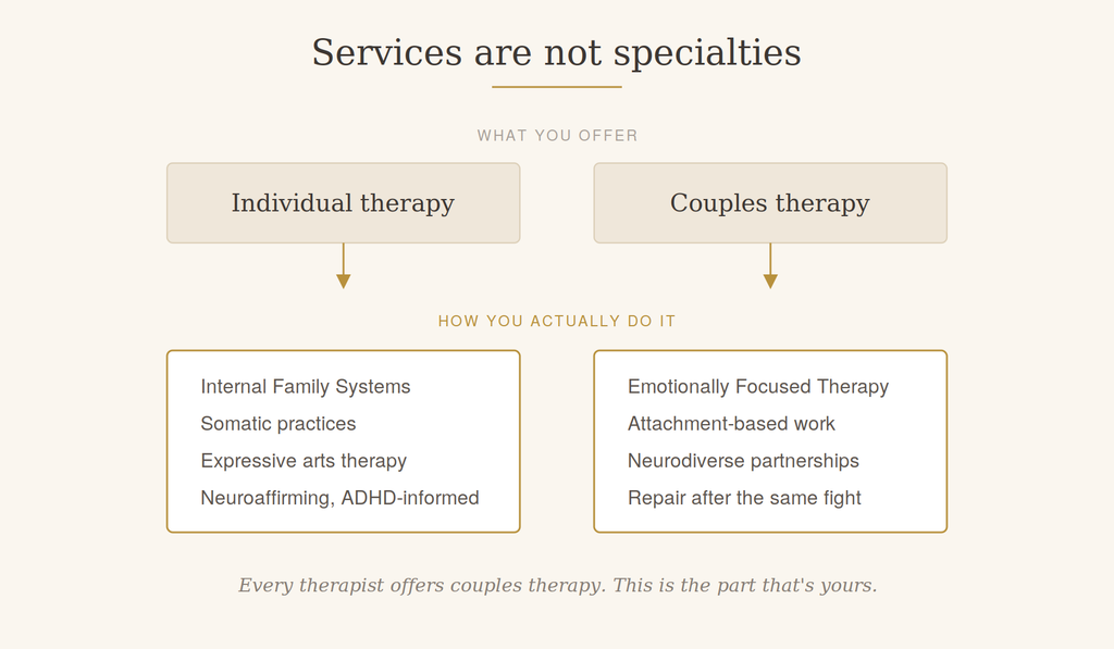
Those aren’t specialties. Those are services. The specialty is what happens inside them — IFS, EMDR, Gottman, somatic work, whatever your particular approach is. And that distinction matters because “I offer individual therapy” tells someone nothing that distinguishes you from every other therapist they’re considering.
Every therapist who works with couples wants their couples to stop having the same fight. That’s not a differentiator. What’s unique is how you sit down with a couple — what you prioritize, what you focus on, what your guiding principle is in that work. That’s what gives someone a feel for what it would actually be like to be your client, and that’s what makes them take the next step.
Generic language doesn’t lose people. It just doesn’t win them.
There’s a line on Lauren’s homepage that reads something like: many people get stuck reacting in ways they don’t fully understand, and we’ll explore your patterns in a supportive, practical way so you can feel more grounded.
Nothing about that is wrong. Nobody’s going to read it and back away.
But nobody’s going to feel spoken to either, because it isn’t specific enough for anyone to recognize themselves in it. And that’s the quiet way websites fail — not by saying something off-putting, but by saying something so broadly true that it slides right past.
How to find the words: mine your own notes
This is the most useful thing I know, and almost nobody does it.
You are uniquely positioned to know exactly what your clients are struggling with, because you are literally inside your clients’ heads. That’s your ace in the hole, and it’s sitting in your files right now.
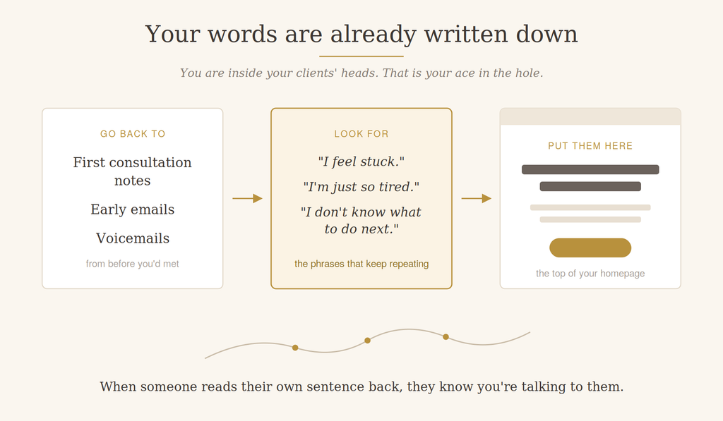
Go back to your first-consultation notes. Go back to the emails people sent you and the voicemails they left when they were first reaching out — before they’d done any work with you, when they were just trying to describe what was wrong.
And mine them. Look for the words, the phrases, the symptoms people name when they’re asking for help for the first time. Especially the ones that come up over and over. “I feel stuck.” “I don’t know what to do next.” “I’m just so tired.” Whatever your particular people say.
Those exact words go on your website. Because when someone lands on your page and reads their own sentence back to them, they know — instantly and without thinking about it — that you’re talking to them.
Make it easy to reach out
Reaching out to a therapist is already hard. It takes a lot to admit you need help and then go ask a stranger for it. So we want that moment to be as easy and as clear as we possibly can make it.
Lauren does one part of this well — there’s a “Schedule a free consultation” button at the top of the page and another in the corner, so wherever you are, there’s a way to act.
Two things I’d change.
Add a phone number at the top. Some people want to call. Whatever way a person prefers to reach you, we want it available with minimal friction.
Define what a consultation actually is. “Schedule a free consultation” sounds obvious to you, but there are no parameters around it. Am I talking to you or to a secretary? Is this an in-depth evaluation? Do I have to come in and sit down? Is this going to be twenty minutes of you telling me everything that’s wrong with me?
To you it’s obviously a short phone call to see if you’re a good match. To someone who has never done this before, it’s genuinely unclear, and the word “consultation” sounds formal enough to be a little frightening.
Two sentences fixes it. Something like: we’ll talk for about fifteen minutes so I can hear what’s going on and you can get a feel for me. There’s no pressure, and if we’re a good fit, we’ll schedule a first session. That’s all it takes, and people are dramatically more likely to click.
The small things that add up
These matter less than everything above, but they’re quick, and they’re the kind of thing that makes a site feel harder to use without anyone quite knowing why.
Contrast. On Lauren’s site the headline text is a lovely off-green and the background photo behind it is bluish, so the letters don’t stand out as well as they should. It’s a little harder to read, and it’s a little less accessible — and accessibility on a therapy website isn’t a technicality, it’s the whole point.
The logo. There’s a white box behind Lauren’s logo that doesn’t match the rest of the menu bar. That’s almost certainly because without the white background, the logo doesn’t have enough contrast to be visible — which makes complete sense as a fix. But the better solution is to change the background bar itself, so the logo can sit transparent and everything in that top strip is readable together.
Menu order. Lauren’s menu runs About, For Clients, Resources, Services. “For Clients” is a portal for existing clients, and it sits second, while Services — the thing new people came to find out about — is all the way at the end. Your website’s main job is to help new people discover you, so Services should come forward.
Testimonials. Hers are ethically collected from other professionals rather than from clients, which I think is great and exactly the right call. They’re just very large — full page width. Smaller, with slightly rounded corners, and they’d carry the same weight without taking over.
Consistent voice. Her services page says “we” but she’s a solo practitioner. Small disconnect, easy fix.
And Google can’t tell what you do either
Everything I’ve said about a human visitor is also true of a search engine.
If your website never says, in plain words, that you’re a neuroaffirming therapist who does IFS and works with ADHD moms, Google has no reason to show your site to someone searching for exactly that. It isn’t being difficult. It genuinely doesn’t know.
That’s why the buried-treasure problem costs twice. Those pages don’t exist, so people can’t find them by searching, and the information isn’t visible, so people can’t find it by browsing either.
And this is the part I find encouraging: the work of being findable and the work of being understood are mostly the same work. When you write a real page about your couples work, in the words people actually use, you’ve done your SEO at the same time.
If you change one thing, change this
Rewrite the top of your homepage so it names the person you help and the problem you help with, in the words they would use.
That’s it. Not a redesign, not a new logo, not a blog. Just that one block of text at the top.
It’s the highest-value thing on the entire site, it’s the thing almost everyone gets wrong, and you can do it in an afternoon without touching anything else.
If you want a second thing: build a real page for whatever your buried treasure is.
Related reading:
Your website isn’t your resume
Here’s what all of this comes down to.
Your website is about access to care. Lack of information is a barrier to care. When there isn’t enough information on the page, somebody who would have been a wonderful fit — who really needed exactly what you know how to do — comes to your site, can’t tell, leaves, and doesn’t get help.
So when I say a website is unclear, I don’t mean you’ve written something that doesn’t make sense. Lauren’s website makes perfect sense. I mean we’re not saying the right things, for the right people, in the right order.
Your website isn’t your resume. Your website is the first thing a person in trouble sees when they’re deciding whether to reach out. Write it for them.
And with Lauren’s site — as with most of the sites I look at — the question was never really what do we need to add. It was: what does she already do that we need to bring to the surface?
I’d guess the same is true of yours.
If you’d like help with any of this, that’s what I do — I build websites for therapists in private practice, and my inbox is open. If that makes sense.